
My name is Steven Calhoun.
I am a multidisciplinary designer based out of Somerville, MA.I have an educational background in product design, design research, and business strategy. In short, I am obsessed with the intersection of design and business innovation. I love investigating how businesses lead their industries with strategic design positioning. All products and services have the same end goal: to give the user value that is worth the time/monetary cost. Design thinking can help find ways to make both the provided value more catered, and the cost more optimized. I believe design is a tool that helps us make sense of complex systems, and that is what perpetuates my love for problem-solving through design.
I began my journey as a designer in the garage of my childhood home, building toys, skate ramps, and forts as my father built Spanish missionary-style wood furniture out of cherry and walnut woods. By constantly building and prototyping, even as a child, I recognized the power of articulating thoughts through different mediums.
This process of building, refining, and repeating was ingrained in my head. I always knew I wanted to become a creator, but what I didn’t know was what I would end up doing for a profession. Design found me as I was looking for jobs that focus on expression, understanding, and creation.
Outside of professional life, I love creating watercolor and multi-media artwork. I push pigments around until my brain feels happy about it. Painting makes me feel calm, nothing more to it!
Art portfolio :)
Email here: Stevenmcalhoun@gmail.com
Or click here: Contact form
Art portfolio :)
Contact me
Bored? Need a drink? Want to show me pictures of your dogs? Want to ask me what the image is? ...Or maybe you want to talk about working together. Whatever it is, hit me up, and let’s chat!Email here: Stevenmcalhoun@gmail.com
Or click here: Contact form


Good design is fun (ctional)
- Design is a systematic process of solving problems within the limitations set onto us.
-
Design is a method of communication that allows stakeholders to understand and translate our intents into action.
- Design solutions balance the needs of your users while ensuring your organization’s goals are achieved (these things ideally align!
Good work makes me happy
The thing that excites me most about design is its ability to teach me new things. Curiosity and stubbornness drive my quest for understanding. Design allows me to approach specific problems with definitive parameters. I’ve always thought that the most successful outcomes are generated from times of stress, limitation, and ambiguity.Process makes perfect (ish)
Design without process is like baking without measuring. You may know what you need, you may know all the required materials, but without the correct sequence of steps, you’re leaving a lot of the work up to assumptions and luck.My design process
- Investigate
The most important aspect of design is understanding. This means understanding your goals, users, and the limitations that always come to rain on your design parade. - Iterate
Once the fuzzy ideas begin to form a design solution, the best thing to do is to create and fail. Only through knowing what is working and what is not can you truly tell if your solutions are perfect. (Inherently, no design is perfect though) - Assess
Design methodology, much like the scientific methodology, relies on proving your hypotheses. Through user testing, designs are able to be “torn apart”. In other words, by assessing your designs, you are also allowing for the holes to show, for the oversights to be highlighted, and for the effectiveness of the design to be evaluated.
And repeat!
This is all good and dandy, but if you don’t continually aim for improvement, what’s the point of designing?
EXPERIENCE
STRATEGY
RESEARCH
RefleXion Medical provides cutting-edge radiation oncology utilizing the novel Biologically Guided Radiation Therapy (BgRT), which combines PET technology to show the treatment system exactly where the cancer cells are and when to shoot... in real time.
RefleXion Medical is developing technology that pushes the boundaries of radiological care. Their product is a Radiation Oncology machine that can provide two different modalities of treatment: Image Guided Radiation Therapy (IGRT, the industry standard) and the novel Biologically-guided Radiation Therapy (trademarked as SCINTIX Therapy).
As a UX Designer at RefleXion Medical, I worked on the Product Strategy team as the sole designer. This team was made up of the Director of UX Design (my manager), the Director of Product Management, the Chief Technology Officer, another product manager, and a technical writer. Being a designer embedded in this influential and strategic team meant I had a prominent role in our product and design strategy and helped drive the platform roadmap.
Additionally, I managed customer feedback and conducted market research to design platform features, documentation, and usability improvements to support four different workspaces: Patient Management, Treatment Planning, Treatment Delivery, and Medical Physics.
Presentations can be given upon request!
Due to the nature of RefleXion Medical, being a startup and having novel, unreleased technology, I am only able to present my design work live.
Treatment Analysis Overhaul
Case study - UX & ResearchAn overhaul of treatment review UX for the X2 Platform, driven by user feedback, adding the ability to treat and review multiple delivery sites.
Patient Records Overhaul
Case study - Platform Redesign A platform redesign of record management, researched and designed to support more complex clinical planning use cases.
Regulatory + Market Research
Case study - Regulatory ResearchA Collection and analysis of Nuclear Medicine Technologist user behavior and state regulations + requirements for novel clinical workflows.
EXPERIENCE
STRATEGY
RESEARCH
Toast empowers the restaurant community to delight guests, do what they love, and thrive in an evolving industry
Toast sells software solutions tailored for the restaurant industry, including point-of-sale systems, online ordering, inventory management, and customer relationship tools. Their products streamline restaurant operations, enhance customer experiences, and drive business growth.
As a Product Designer at Toast, I worked supporting three different teams. My primary areas of product responsibility were Authentication and User Access + Security. I worked within a triad consisting of product management, engineering, and design in order to research and design platform offerings to support teams across the company and more importantly, every single customer and user of Toast software. I also offered design strategy consultation for a third team at Toast.org, Toast’s non-profit arm, focusing on supporting the communities surrounding our customers’ businesses.

Permission Design Vision
Case study - UX & ResearchAn overhaul of access management UX for the Toast platform, led by me and driven by direct user research with iterative testing

Toast for Good
Case study - Strategy A strategic introduction of UX product improvements, driving customers to better support their communities
Toast Customer Support
Case study - UX & ResearchAn urgent improvement to the growing and long-neglected issue of customer caller ID with inaccurate or conflicting data models
Toast - Access Design Vision
Case study - UX & Research
“I want to manage access control across my restaurant(s) efficiently, enhancing permissions as my business evolves and gains insights”
My longest-lasting project and most significant contribution to Toast was my involvement in their complete overhaul of the user access management experience. I supported the Identity Platform from initial concept ideation to technical exploration, user research, and eventually to initial implementation. The core of my contribution was the insistence that we understand the wide range of use cases as soon as possible, so the technical exploration can be focused entirely on users’ Jobs-To-Be-Done, and allow for product representatives to consider the segmenting of new functionality with sales and marketing for various customer business sizes.
The following case study examines the Permission Design Vision project, showcasing my process of simplifying complex data models into a streamlined access management UX for users, in the shift to a significantly more powerful and granular permissioning engine:
The following case study examines the Permission Design Vision project, showcasing my process of simplifying complex data models into a streamlined access management UX for users, in the shift to a significantly more powerful and granular permissioning engine:
Outcome

Reduced job creation friction
12 down to 5 minimum clicks

Enhanced Toast Platform connectivity
3 connected Toast apps

Introduced detailed access reporting
Reducing support volume

Context
Why switch our permission platform now?
The current architecture has reached its limits, hindering the efficient addition of new products and acquisitions, leading to multiple authentication systems and increased operational workload. Customer pain points include grouped and "hidden" permissions, lack of transparency, and difficulty in self-diagnosing issues. The system acts as a blocker for critical customer features, and extending it would be impractical, necessitating a shift to address limitations, improve user experience, and meet evolving legal, security, and compliance requirements.
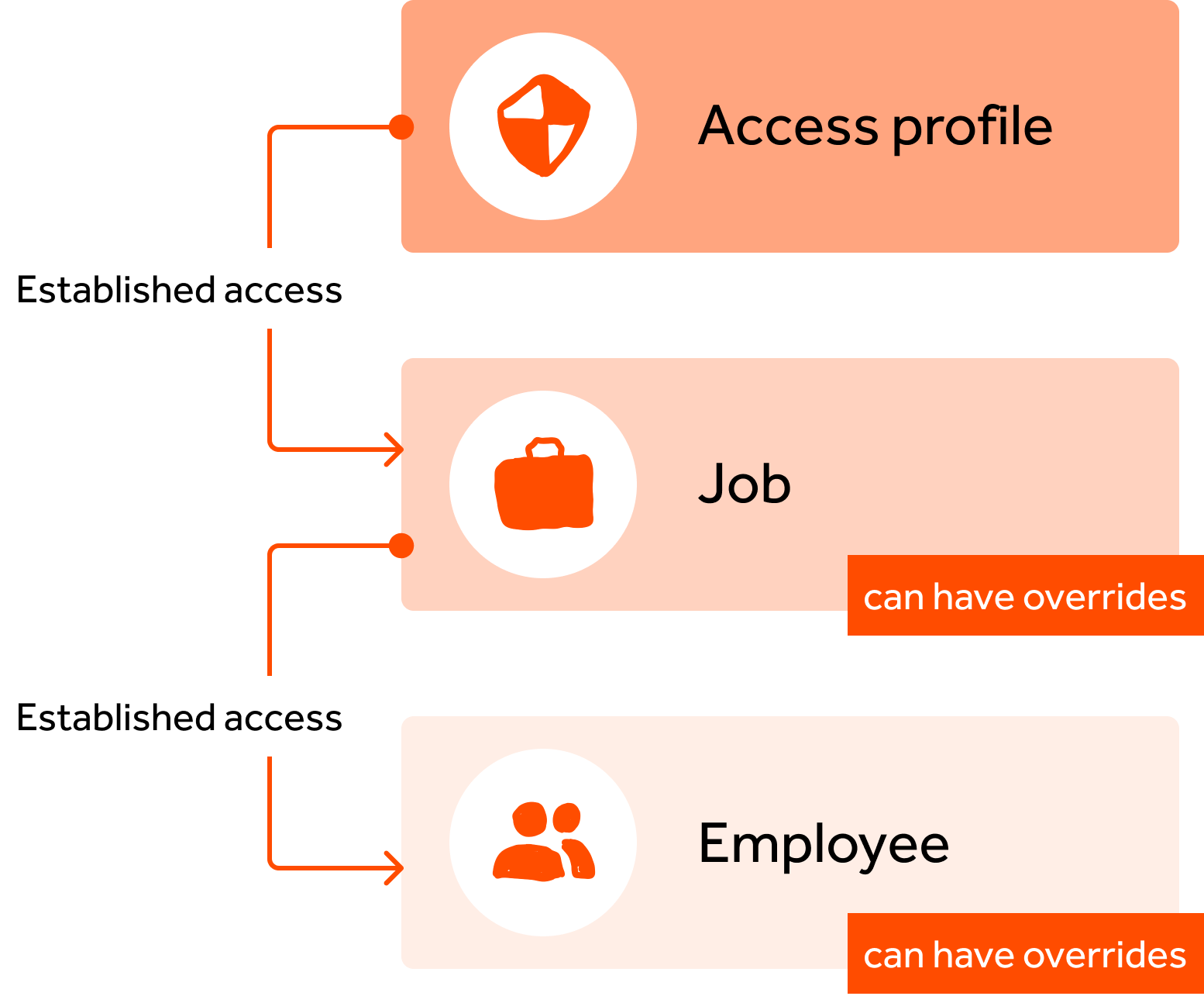
Why switch our permission platform from RBAC to ABAC?

Role-Based Access Controls (RBAC)
Limited, flat permission management at scale“My access is granted directly from job assignment”
I am a chef (Job:Chef)
= I get chef access everywhere my business uses Toast

Attribute-Based Access Controls (ABAC)
Flexible + granular permission management at scale
“My access is based on the sum of my parts”
“My access is based on the sum of my parts”
I am a chef (Job:Chef)
+ I am scheduled right now (Time:OnSchecule)
+ I work at only one location (Location:Here)
= I get chef-related access, on schedule, at my location
+ I am scheduled right now (Time:OnSchecule)
+ I work at only one location (Location:Here)
= I get chef-related access, on schedule, at my location
Complex Use Case illustrating ABAC’s power is Restaurant Franchises:
As a Corporate Admin, I want my Franchisees (Attribute: Employee group) to only be able to edit specific fields (Attribute: Menu, Attribute: Menu Object) within the Menu Editor (Page access rule) at the locations they manage (Attribute: Location).
ABAC allows employees to be viewed holistically by both the user and the platform
︎ User attributes
Franchisee
Location manager
(Who is this person, what do they do?)
Franchisee
Location manager
(Who is this person, what do they do?)
︎ Resource and action attributes
Franchise menus
Menu prices
(What data/action is being accessed?)
Franchise menus
Menu prices
(What data/action is being accessed?)
︎ Access rule
Edit menus
Edit menu prices
(What rules determine grant/deny?)
Edit menu prices
(What rules determine grant/deny?)

Attributes are associated with users to help describe, to our system, who they are:
- Jobs assigned
- Locations assigned
- Shifts scheduled
- Tenure at company
- Age
- Sensitive access
- Anything else a business wants to configure!
With these attributes and rules, our platform determines what a user can interact with in Toast...
Project goals

Preserve mental models
Increasing efficiency in the functions users already perform and preserving mental models even with added functionality

Centralize access management
Ensuring access management encompasses all products within the Toast Platform, in a single location

Make access more clear
Maintain clarity in access assignments to instill confidence in user choices and trust in the platform
Research
Research process
Initial research for overhauling access management at Toast was focused on both technical limitations and opportunities presented by our tech upgrade. We conducted Toast Customer and Customer Success Manager interviews to gather a consensus on current issues, then I personally organized and ran subject matter expert workshops where we rapidly iterated on design solutions.

16 Customer interviews
Direct feedback collected from restaurant owners, people managers, and IT workers at a range of experience levels and restaurant complexities

4 CSM interviews
Collaborated with Customer Success Managers representing every customer segment and helped distill their historical feedback into the themes below

3 Subject matter expert workshops
Stakeholder review in combination with customer engagement allowed for design concepts to be validated and built upon in a rapid yet engaged manner
Historic customer feedback
Collected and distilled with help from Toast Customer Success Managers
Transparency + Visibility
I want to quickly understand who has what access across my business

Accountability
I want to see what was changed, in detail, within my business and by whom

Urgency
I want to respond to emergency access needs immediately if they are needed
Existing experience
Ingrained experiences
Existing experiences have not drastically shifted in the past 5 years and users won’t expect the approach to doing their work to change either.
Permissions represent “trust” and “oversight” to restaurant owners/managers
Decentralized access management
Navigating the hierarchy of access structures across Toast products and management levels was drastically slowing down management activities.

Unclear inheritance structure UI
The inheritance and overriding of access lacked clarity, which led to inappropriate or inaccurate customer access management. Managers face friction for any operation that needs to be done at scale: reviewing access, editing access for groups, and general navigation across the access hierarchy.
The inheritance and overriding of access lacked clarity, which led to inappropriate or inaccurate customer access management. Managers face friction for any operation that needs to be done at scale: reviewing access, editing access for groups, and general navigation across the access hierarchy.
This was NOT CLEAR to our users ︎︎︎
Stakeholder workshop
I led a design workshop for internal stakeholders to best understand both the experiential and business needs regarding access management. The workshop included representatives from engineering, product, sales, customer support, and enterprise teams.
The result of the workshop was our identification and clear illustration of customer Jobs-To-Be-Done, Current pains, and the Potential gains our users make if improvements are made:
The result of the workshop was our identification and clear illustration of customer Jobs-To-Be-Done, Current pains, and the Potential gains our users make if improvements are made:


So what are the access management Jobs-To-Be-Done?
1. Navigate business growth and changes seamlessly
“I want to be able to extend my existing configurations, as my business grows, to other employees, jobs, etc to ease in managing a changing workforce”
“I want to be able to extend my existing configurations, as my business grows, to other employees, jobs, etc to ease in managing a changing workforce”
2. Tailor access permissions for specific employees, roles and contexts
“I want to be able to specify the sensitive access employees hold based on their responsibilities, so I can ensure people don’t have inappropriate access”
“I want to be able to specify the sensitive access employees hold based on their responsibilities, so I can ensure people don’t have inappropriate access”
3. Quickly add employees to my team to begin onboarding
“I want to quickly set up jobs and permissions within Toast so I can jump into my tasks, so I don’t have to waste time doing repetitive data entry”
“I want to quickly set up jobs and permissions within Toast so I can jump into my tasks, so I don’t have to waste time doing repetitive data entry”
4. Access management and assignment for operational efficiency
“I want to configure permissions for groups of people that hold similar responsibilities, so I can reduce the level of manual effort of permission management”
“I want to configure permissions for groups of people that hold similar responsibilities, so I can reduce the level of manual effort of permission management”
5. Conditionally assign or revoke permissions based on specific roles or circumstances
“I want to review and assign access to employees who don’t typically require certain permissions, so I can ensure that operations run smoothly and employees don’t hold irrelevant access”
“I want to review and assign access to employees who don’t typically require certain permissions, so I can ensure that operations run smoothly and employees don’t hold irrelevant access”
6. Discover permissions allowing specific actions without the need for extensive searching
“I want to be able to find specific permissions quickly so I don’t waste time reading every permission to find what I need”
“I want to be able to find specific permissions quickly so I don’t waste time reading every permission to find what I need”
How does access management scale with business size?
Our design research strategy delves into the distinct needs of Small-Medium Businesses (SMBs) and Enterprise Businesses within the global restaurant industry. Through customer interviews and rigorous observations, we identify core user experiences and variations needed for varying business sizes, informing product suite tiering. Utilizing iterative testing and feedback loops, we tailor our approach to create restaurant software that maximizes efficiency for both SMBs and enterprises.
![]()
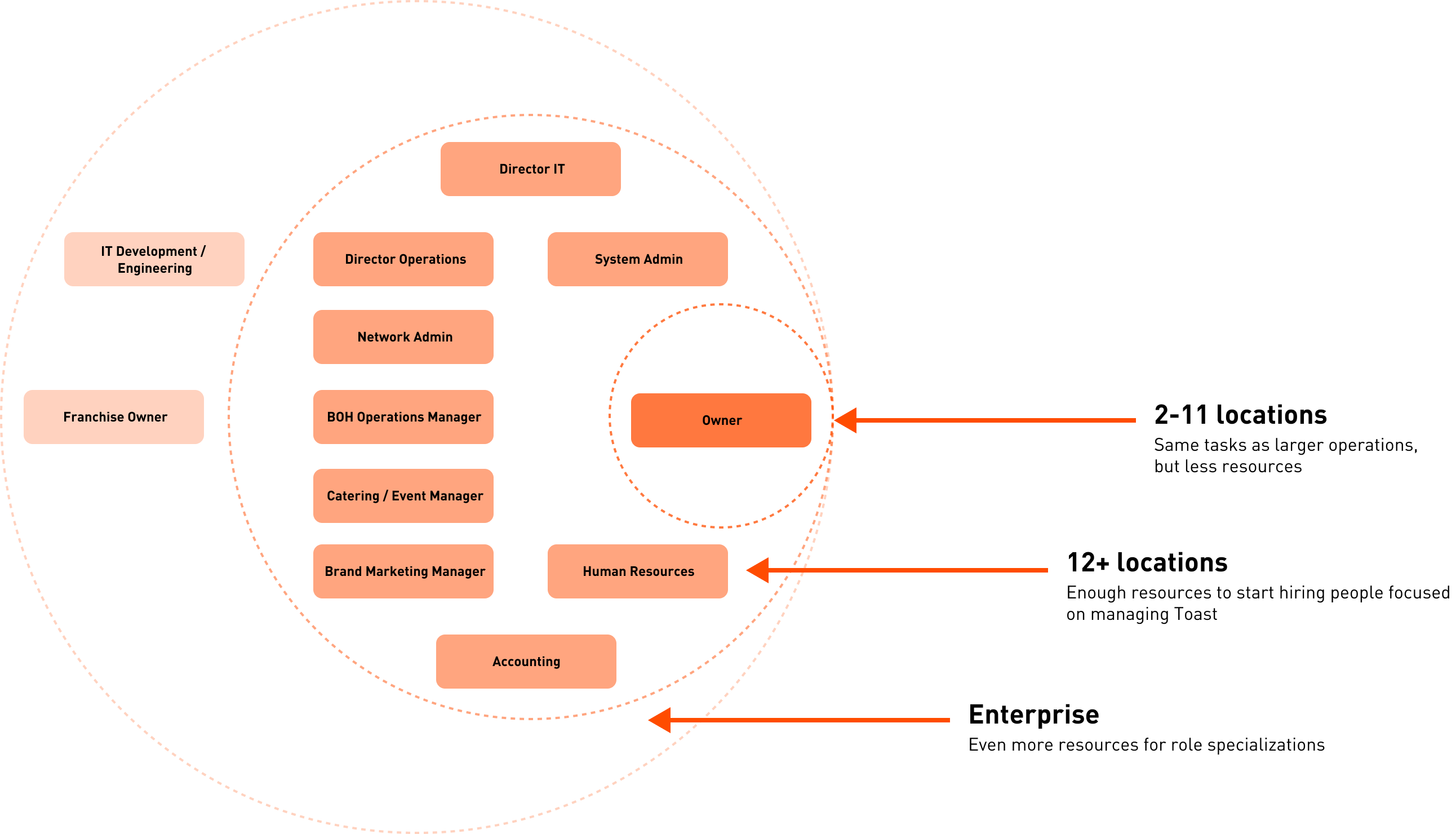

Small-medium businesses
1-100 employees
Closely managed by few

Enterprise businesses
100+ employees
Distributed management, often franchised
100+ employees
Distributed management, often franchised
This understanding helped inform the design choices for the two initial product tiers: Basic Access Management and Enterprise Access Management, with little strategic need for a middle-ground product offering.
Design results
Team Management Dashboard
The Team Management Dashboard displays (in addition to team status and performance data) an overview of access across your organization, including:
- Employees
- Jobs
- Access profiles
- Access requests
- Access reporting
- Access configurations
Changes:
Centralizing team management dashboard, to include all things access, jobs, and employees across different Toast offerings.
Access requests integrated into the existing requests panel, bringing urgent requests to the attention of managers from the context of their dashboard or the Toast Operator app (used by admins/owners).
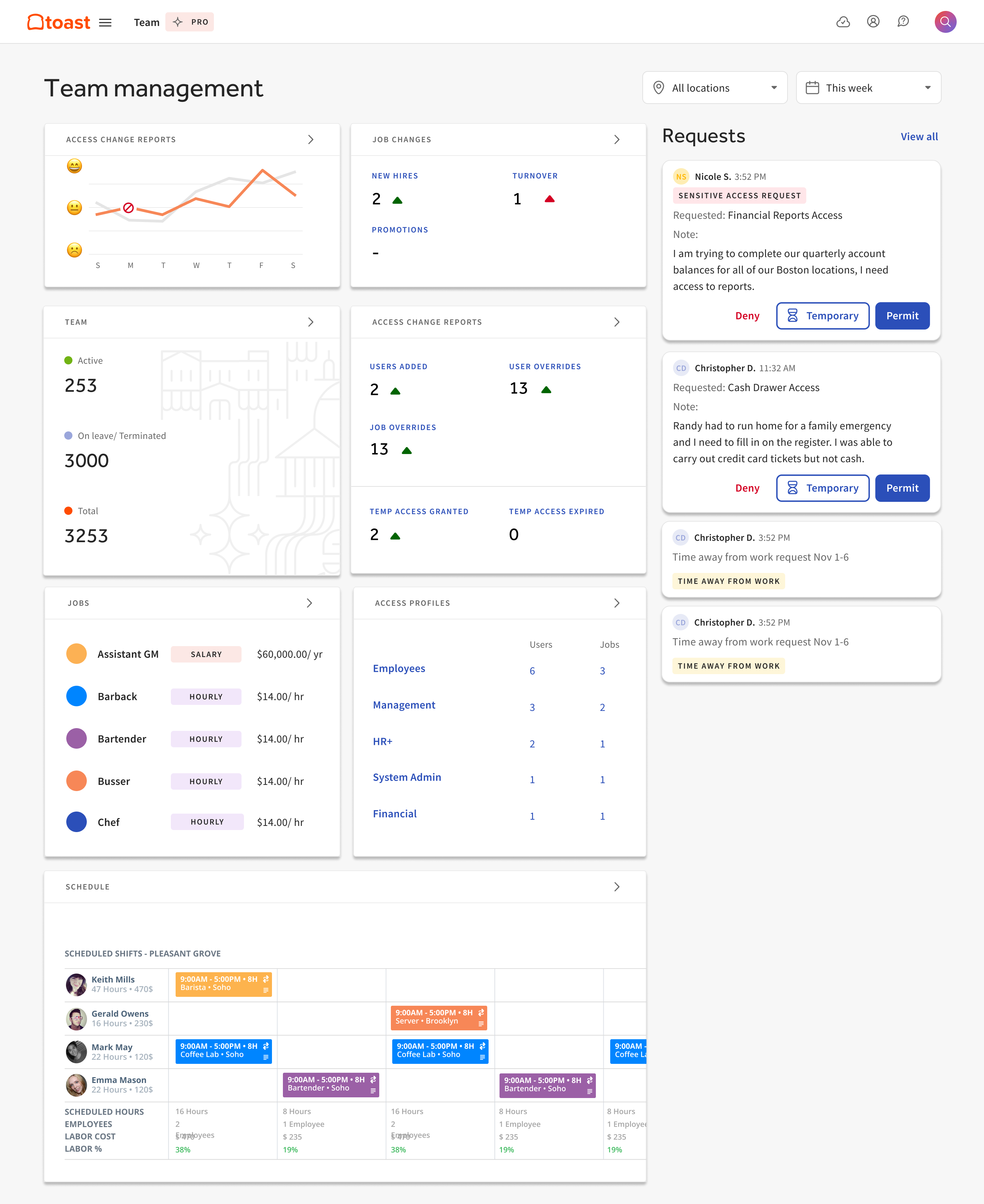
Improved navigation clarity in sub-nav through consolidation of orphaned pages contained under the employees and jobs sub-navs. This resulted in the removal of two entire sub-nav pages which aligned with new product strategy standards.

Employee management
Employee, Job, and Access changes are core to the management experience, and the changes made maintain this importance while adding efficiency.
Changes:
Added contextual information and color coding system for increased understanding of employees at a glance.
Access overview allows for a quick view of an employee’s jobs and the sensitive access they hold before diving into the full, complex list of permissions.

Consolidated permissions list contains new contextual information to reduce the friction in locating specific permissions or features.
Sensitive access overview was added to give quick insight into the most concerning access permissions.
Sensitive access overview was added to give quick insight into the most concerning access permissions.

Permission change review modal allows users to ensure changes made are appropriate before committing updates.

Job management
Jobs are the essential entity for determining what an employee does within Toast and the changes made to the job creation flow reduced both friction and mental load:
Changes:

Toast-Recommended quick start templates reduced friction during employee creation by prepopulating permission assignment based on common industry jobs.
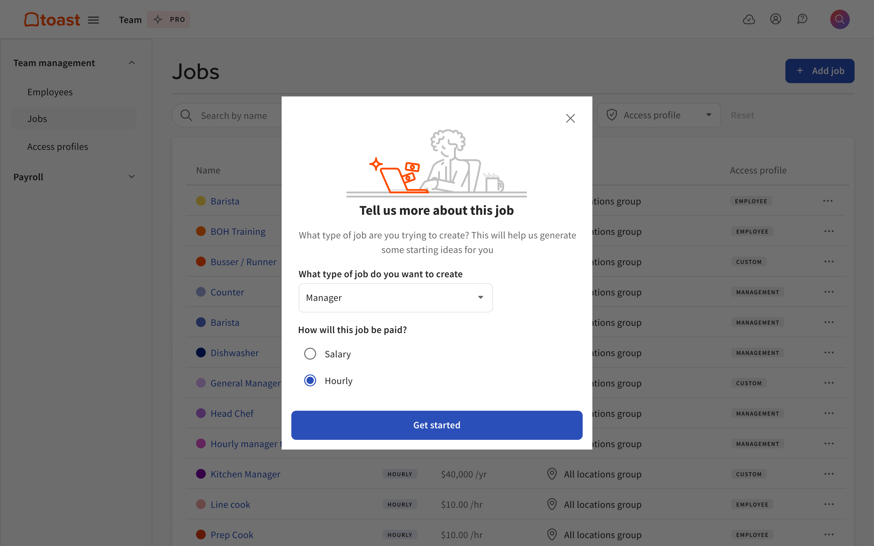
Auto-populated fields from previous “job type” selection reduces the friction of job creation because the system knows exactly which configurations similar jobs require.

Sensitive info overview was added to give quick insight into the most concerning access permissions.

Bulk access management
Access profiles are assigned at the job level and allow for bulk management of sensitive permissions across jobs in the user’s respective management level. This allows for sweeping edits and highly granular configuration that flexibly caters to a range of restaurant sizes.
Toast provides a collection of premade access profiles that cover the most common access roles, while strategically offering custom access profiles within Team Management Pro for larger enterprise customers.
Changes:
Access profiles were more clearly defined to make a streamlined inheritance structure that enables large-scale, accurate, sensitive permission assignment.

Sensitive access summary allows for a quick understanding of access without diving into the full list of permissions.

Access reporting
Historic view of all access changes within the respective user’s management level. Allows for a deep understanding of access activity and accountability to be held for both employees and business auditing
Changes:
Access reports tool with the ability to filter employees, access profiles, changes made, and impact of changes.

“View access report” throughout the Toast Platform makes reporting accessible from anywhere objects are named/displayed: employee profiles, permissions, jobs, and access profiles.

Save and export reports for future reference allowing customers to maintain regulatory documentation.

User reception
Small-medium businesses
“I love that I can rely on presets and dive deeper if needed, I’m not a power user and this is simple for me”
- Sandra, Restaurant owner
“Oh, this is much faster, both creating and managing access”
- Nico, Restaurant manager
“It is nice to see everywhere access is coming from, without having to zoom in and out repeatedly”
- Richard, Restaurant owner
Enterprise businesses
“Access profiles now make me more confident managing access in bulk”
- Enrique, Regional manager
“The new reporting tool let’s me both troubleshoot and routinely review my customer’s employee access”
- Michael, Customer success manager
“I am excited to start using ABAC, being able to configure my own attributes and access rules will solve almost all my problems”
- Lee, Restaurant IT admin
In collaboration with
︎ Toast Teams
Ensured proper handling of disparate data models, crucial for access and permissions, especially with sensitive info like payroll, PII, and private business data.
Ensured proper handling of disparate data models, crucial for access and permissions, especially with sensitive info like payroll, PII, and private business data.
︎ Enterprise Growth
Ensured comprehensive consideration of customer needs, balancing the core access management experience for both small businesses and larger organizations.
Ensured comprehensive consideration of customer needs, balancing the core access management experience for both small businesses and larger organizations.
︎ UX Research
Challenged and validated design assumptions, relying on customer feedback for insights and ensuring choices aligned with user research and business goals.
Challenged and validated design assumptions, relying on customer feedback for insights and ensuring choices aligned with user research and business goals.
︎ Security
Ensured no oversight was made for the UX of managing highly sensitive access. Empowering users to trust the decisions they make regarding their data access.
Ensured no oversight was made for the UX of managing highly sensitive access. Empowering users to trust the decisions they make regarding their data access.
︎ Content Design
Consulted for common language usage and historical language feedback. Moved away from engineering-led language and advocated user-driven nomenclature.
Consulted for common language usage and historical language feedback. Moved away from engineering-led language and advocated user-driven nomenclature.
Toast for Good
Case study - Strategy
“I want to use my restaurant as a platform for supporting my local and global communities”
As a design consultant for Toast for Good, their non-profit branch, I led initiatives to help enrich the global food experience and contribute to a healthier, more sustainable, and equitable world. Most notably, I transformed the charitable donations program within their Guest Engagement suite, enabling customers to support established non-profits and their local community with more ease.
The following case study examines the Charitable Campaign Creation Flow, showcasing my approach to phasing improvements for a team with intermittent development capacity:
The following case study examines the Charitable Campaign Creation Flow, showcasing my approach to phasing improvements for a team with intermittent development capacity:
Outcome
Total funds fundraised
Increased by 1400% from $100K to $1.5M raised in one year
$1.5 million
Increased by 1400% from $100K to $1.5M raised in one year
Concurrent campaigns
Increased by 132% from 349 to 810 campaigns in one year.
810 campaigns
Increased by 132% from 349 to 810 campaigns in one year.
Giving to
Plus local causes that were self-defined, allowing for mutual aid fundraising
2+ million charities
Plus local causes that were self-defined, allowing for mutual aid fundraising
Context
Problem space
Restaurant owners have no way to support their local community or non-profits they are passionate about, in a way that is easy to maintain while keeping taxes in check
Restaurant owners are often some of the most known and beloved members of any community. This is especially true when these individuals can support the same community that supports them and their livelihood.
Toast for Good introduced the Charitable Campaign tool in 2022; however, the functionality was very limited due to a lack of resources. Users were forced to recreate campaigns manually, and there was no way to review campaign performance or history.
Project goals
Business-catered fundraising Allowing customers to configure fundraising campaigns specific to their business and communities

Tax-conscious experience Relieving the burden of tax record keeping and allowing customers to easily keep track of funds raised and dispersed

Easy and repeatable
Enabling customers to consistently raise funds and keep campaigns running without tedious maintenance
Design
Existing campaign creation flow
The existing flow consisted of cause selection and campaign details being collected in one single screen. Users lacked context to understand the intent behind each field being collected and had no way to edit after creation.
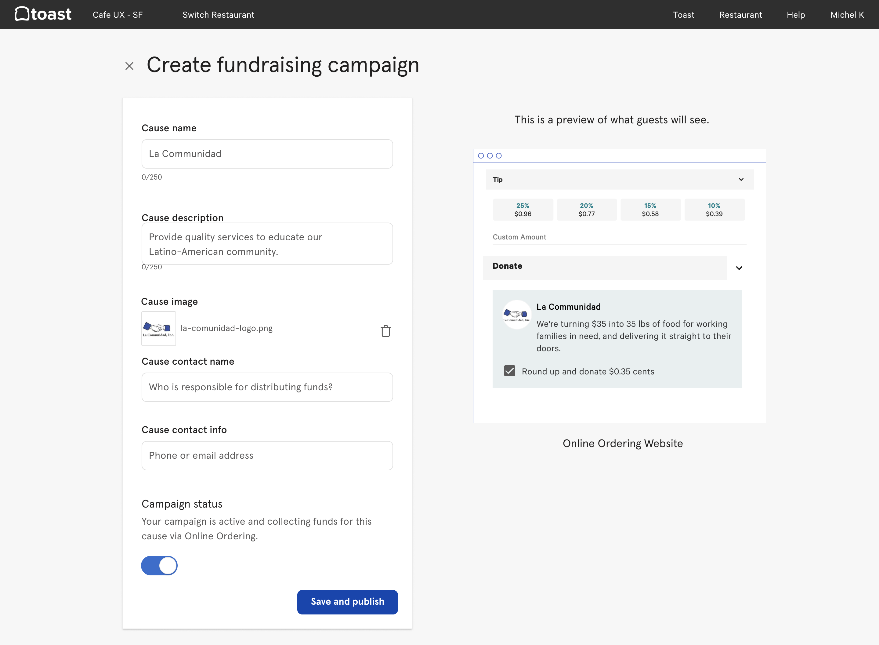
Improved campaign creation flow
The improved flow separates creation into four steps: Cause selection, Campaign details, Collection method, and Review.
︎ The friction added from this addition of steps was justified by the infrequency of campaign creation, the need for a more detailed explanation (both for legal and UX), and the new user research-driven auto-renew campaign functionality.
1. Cause selection

Select from a list of verified 501(c) non-profits, or enter details for direct mutual aid
Improved clarity of difference between 501(c) charities and individuals/groups, and their associated distribution/ documentation requirements
2. Campaign details

Describe the cause you are raising for and why you are asking for support
Increased focus on who and why funds are being raised, bringing benefactor logo/image to the forefront and separating campaign details from previous data
3. Collection method

Select how restaurant customers can donate and in what increments
Introduced “flat rate” and “round up” options to the existing “percentage of total” method, with related increment configuration for better business customization
4. Publish campaign
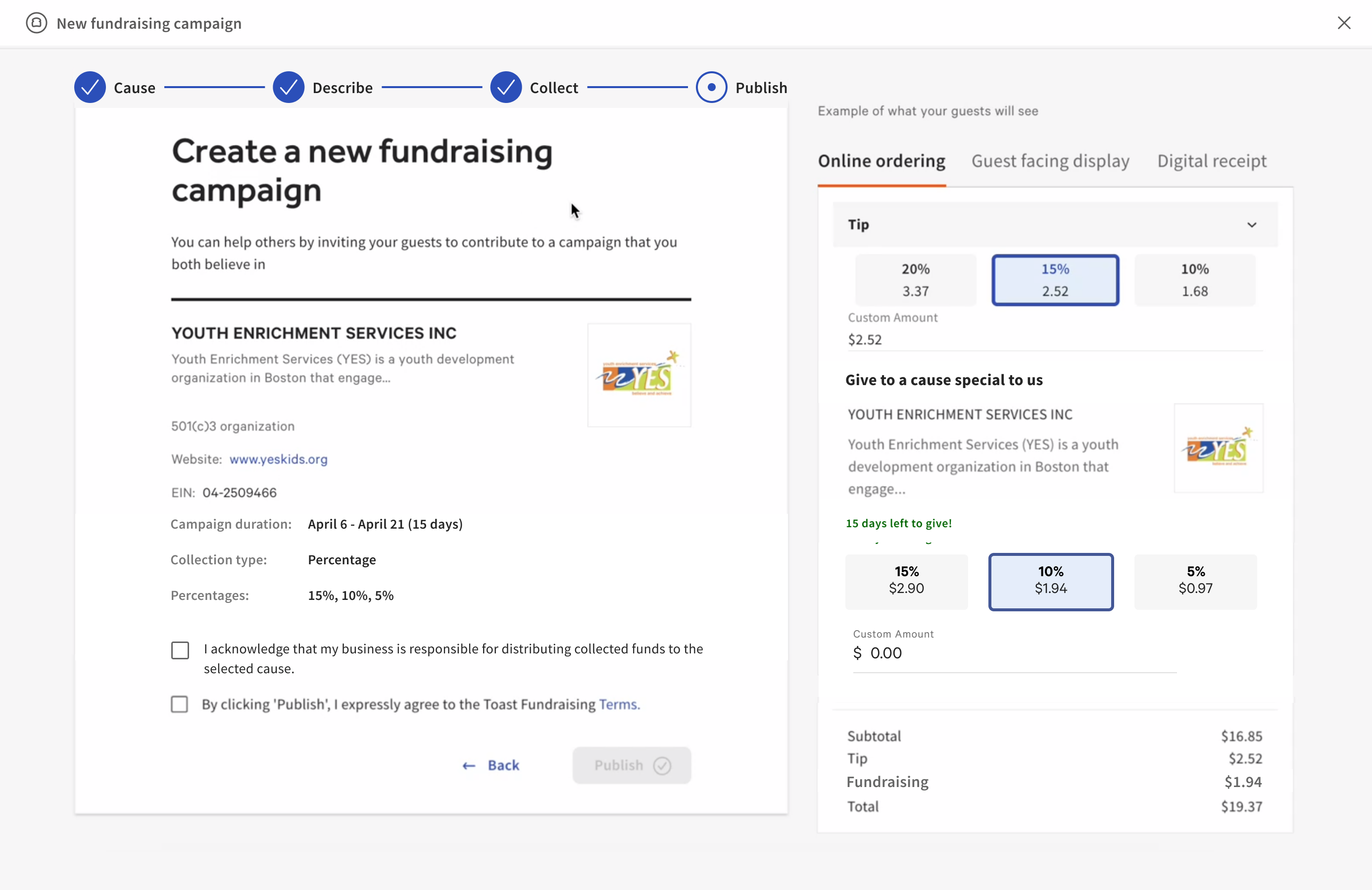
Review campaign details and agree to Toast Fundraising Terms before submitting for campaign launch
- Added campaign review step to ensure accurate information and fundraising narrative.
- Improved guest-facing preview allowing users to view configured collection methods before submitting.
- Added legal agreements and improved language for legal notices throughout the flow.
Campaigns Summary Dashboard
The Campaign Summary Dashboard was created to help users understand existing campaign performance, view historic campaign details, and quickly configure new campaigns. Providing one central location for fundraising and funds distribution.


Review all campaign performance, retrieve fund distribution details, and view historic campaign performance
- Net-new dashboard, giving users a central place for fundraising in Toast
- Introduced channel performance to give insight into when/how customers are donating
- Integrated the (orphaned) Campaign Marketing Widget into the dashboard to more tightly knit related products
In collaboration with
︎ Associate Director of Product
Representing the product strategy and business objective, and worked with myself to conduct and review user research
Representing the product strategy and business objective, and worked with myself to conduct and review user research
︎ Staff Software Engineer
Solely supported the implementation of and testing of experience overhaul, worked in increments to achieve the final designed UX
Solely supported the implementation of and testing of experience overhaul, worked in increments to achieve the final designed UX
Toast Customer Support
Case study - UX & Research
“I want to swiftly identify callers, their businesses, and access permissions to expedite resolution of their support call inquiry.”
Customer care is a crucial factor as to why Toast customers are so loyal. In the world of restaurants, literal fires disrupt people’s workday, and the last thing someone wants is to wait on the phone for an agent to understand who you are, where you work, and what you do at your company. To the customer, it feels like our agents don’t care about who they are.
The following case study walks through deconstructing the pre-existing Customer Caller Support user flow to urgently address the growing problem of caller identification, showcasing my ability to quickly learn new tools + processes and provide experience improvements:
The following case study walks through deconstructing the pre-existing Customer Caller Support user flow to urgently address the growing problem of caller identification, showcasing my ability to quickly learn new tools + processes and provide experience improvements:
Outcome
Average handle time (AHT)
Reduced AHT by 3-8%
Depending on the inquiry category
Reduced AHT by 3-8%
Depending on the inquiry categoryAgent onboarding
Revamped enablement
Enabled agents to work within current mental models with improved efficiency
Revamped enablement
Enabled agents to work within current mental models with improved efficiencyDefined data source of truth
Ever-increasing data accuracy
Implemented data entry/update step for new contacts, syncing across data models
Ever-increasing data accuracy
Implemented data entry/update step for new contacts, syncing across data modelsContext
Problem space
Restaurant Customers calling Toast Care for support experience long wait times and tedious agent interactions to simply get found within the support agent’s systems.
Restaurant customers reaching out to Toast Care for support encounter frustratingly long wait times and tedious interactions with agents as they navigate the ordeal of being known by the support systems. The extended wait exacerbates their concerns and prolongs the impact on their business, leading to a suboptimal customer experience.
Streamlining the support process and enhancing system efficiency is essential to ensure timely and effective assistance for restaurant owners and staff relying on Toast.
Streamlining the support process and enhancing system efficiency is essential to ensure timely and effective assistance for restaurant owners and staff relying on Toast.
Goals
Speeding up bottlenecks
More quickly identify users and verify their information to more quickly address the actual intent of the call

Personalized care
I want to see what was changed, in detail, within my business and by whom
Using existing data
I want to respond to emergency access needs immediately if they are needed
Support agent tool ecosystem
Customer support agents use a variety of tools to both document and assist in customer inquiry fulfillment.
These tools are powerful, but over the years the disparity between the data models of Salesforce (sales and support processes) and Toast (admin support) has become significant. The more accurate of the two data models was Toast, and moving forward we aimed to use this as the source of truth and clean it up when/where we can.
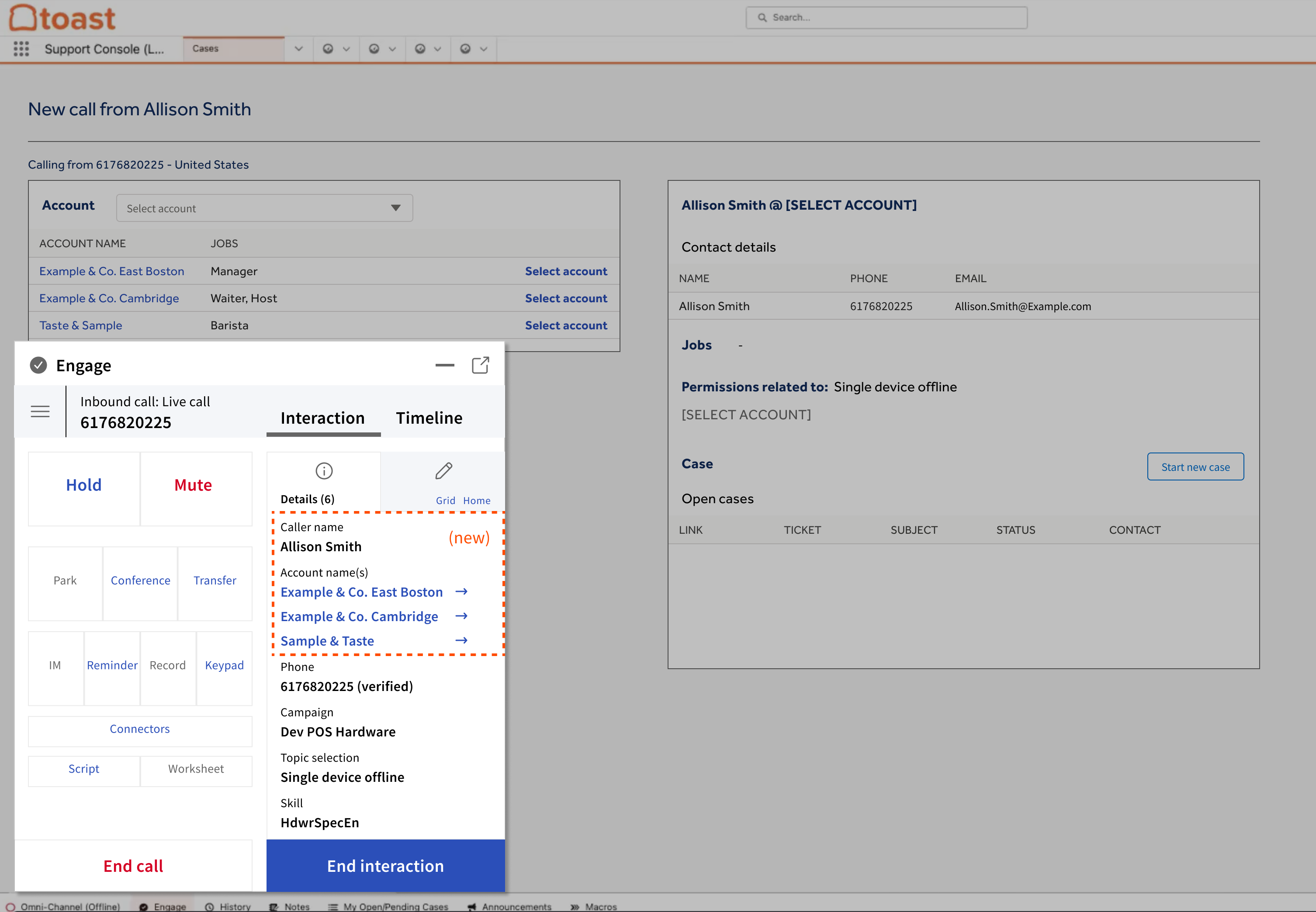
Who is calling me?
How do I track support cases?
How do I support + resolve issues?
Research
Agent focus group
To better understand the context of Toast support agents’ work, a focus group of internal agents and contracted call center agents was organized. We discussed the major friction points of serving customers, and agents described the worst part of their job is simply waiting for customers to spell out their names and having to read it back for confirmation. The process feels impersonal to the customer and is a highly manual process for the agent.
Toast Customer Care: 4 agents
“I spend more time spelling names than I do finding the solutions to caller problems”
“When owners call in, I can tell they get annoyed we don’t ‘know’ them”

Contracted support: 6 agents
“It’s frustrating that I can’t instantly access data we have on callers. I know it’s in there as soon as they mention a restaurant name”
“As a support agent, I feel personally bad that I have to put people through this slow process”
So where were the bottlenecks?
1. ︎ Category selection
Five9: ~45 secondsCustomer calls support and enters category codes into IVR
Five9: ~45 secondsCustomer calls support and enters category codes into IVR
2. ︎︎︎ Call routing
Five9: Varies based on call volume
Customer is routed to agent group based on selection, on hold
Five9: Varies based on call volume
Customer is routed to agent group based on selection, on hold
3. ︎ Greeting
Five9: ~30 secondsAgent greets caller, asking who they are speaking with, and where they are calling from
Five9: ~30 secondsAgent greets caller, asking who they are speaking with, and where they are calling from
4. ︎ Identification
Salesforce: ~2-3 minutes (!!!)
Agent transcribes caller and business name, letter by letter, prone to entry errors
Salesforce: ~2-3 minutes (!!!)
Agent transcribes caller and business name, letter by letter, prone to entry errors
5. ︎ Contact + company selection
Salesforce: ~30 secondsAgent creates contact for caller after selecting company, creates new case or selects case
Salesforce: ~30 secondsAgent creates contact for caller after selecting company, creates new case or selects case
6. ︎ Supporting caller in Toast
Toast: [Varies based on inquiry]Agent clicks link to Toast, in Salesforce, to pull up support dashboard in context of selected company
Toast: [Varies based on inquiry]Agent clicks link to Toast, in Salesforce, to pull up support dashboard in context of selected company
Design
Five9
Changes
- Agents able to address callers by name if caller has verified Toast account
- Data transferred from Toast ︎︎︎ Five9 ︎︎︎ Salesforce when account is selected from Five9
Outcome
- Reduced average handle time by between 3-8% (depending on inquiry category)
- Focused design intervention on the 76% of callers that are verified Toast account holders
- 24% of unverified callers remain in the existing manual flow
Agent script before
“Hello, can I ask who I am speaking with?”
“Can you spell that for me?”
“Let me repeat this back to you... A L I S O N, and S M I T H, was that correct?”
“Okay and now can you tell me what business you’re calling from?”
“Can you spell that for me, again?”
“Let me repeat this back to you... E X A M P L E & C O, E A S T B O S T O N, was that correct?”
“Okay, Alison, how can I help you today?
Agent script now
“Hello, Alison! Before I assist you, can I ask where you’re calling from?”
“Example & Co East Boston? Perfect. How can I help you?”
Five9 overlay over Salesforce account selection
![]()
Verified caller: One account
![]()
Account auto-selected if a contact only has one associated account
Account auto-selected if a contact only has one associated account
Verified caller: <3 account
![]()
Quick select of Account for 90% of callers that work at <3 Toast restaurants

Quick select of Account for 90% of callers that work at <3 Toast restaurants
Verified caller: >3 accounts
![]()
>3 Accounts require more detailed review and must be completed in Salesforce

>3 Accounts require more detailed review and must be completed in Salesforce
Salesforce
Changes
- Salesforce contacts updated/created from Toast data, creating a living association between Toast Business Profile (driven by the Customer Contact Platform initiative)
- Displaying jobs and permissions held within the restaurant gives agents a better understanding of who they are talking to
Outcome
- Alignment across Toast data teams for dedicated data source of truth to maintain and clean customer contact data
- Less time spent in Salesforce, which is a tool for record-keeping not customer support tasks
- Less wasted support efforts since agents can view caller jobs and determine permission to request changes
Salesforce account selection
![Multiple accounts associated with contact]()
![Single account associated with contact]()


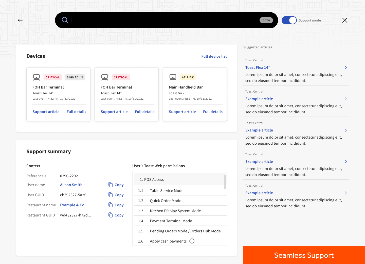
Toast Support
Changes
- Immediate view of device status due to high volume of use vs relatively inconvenient location
- Summary of contact and their identity within the restaurant
- Related support articles based on IVR category selection
Outcome
- 92% of support calls prompt agents to select “Open Toast” from Salesforce rather than spending time looking for identification data within Salesforce
Toast Support Summary
![]()
In collaboration with
︎ Toast Care
Customer Support collaborated closely to enhance agent workflows, optimizing the customer support call efficiency
Customer Support collaborated closely to enhance agent workflows, optimizing the customer support call efficiency
︎ Internal enablement
Defined the agent enablement process for new changes to their workflows, ensuring a smooth transition and improved operational efficiency
Defined the agent enablement process for new changes to their workflows, ensuring a smooth transition and improved operational efficiency
︎ UX Research
Challenged and validated design assumptions, relying on customer feedback for insights and ensuring choices aligned with user research and business goals
Challenged and validated design assumptions, relying on customer feedback for insights and ensuring choices aligned with user research and business goals
︎ Customer data platform
Ensured we took every opportunity to both maintain data accuracy and reduced customer support friction in the future as a result
Ensured we took every opportunity to both maintain data accuracy and reduced customer support friction in the future as a result
︎ Partner integrations
Enhanced third-party software utilized by agents, leveraging my expertise to improve the overall software ecosystem for more effective customer support
Enhanced third-party software utilized by agents, leveraging my expertise to improve the overall software ecosystem for more effective customer support
EXPERIENCE
INTERFACE
RESEARCH
Pegasystems streamlines customer service operations by automating case management, enhancing customer interactions, and ensuring compliance with both service level agreements and regulatory requirements.
Pegasystems is a business process automation software company that helps clients modernize and “Build for Change”, allowing clients offerings to evolve alongside customer expectations. Pega software helps enterprises make better decisions and get work done faster.
As a UX Product Designer, I was responsible for seven different apps with the Pega Customer Service and Pega Healthcare horizontal teams.
Research Process
Though I supported seven different apps, the process for designing these apps always starts with a similar research process. Working with product owners, developers, and business stakeholders, my process begins by understanding what each team is hoping to achieve during each product release. We receive business requirements that guide us, but these requirements often don’t consider everything a user may need or be experiencing.Projects kick off:
- Stakeholder workshop
- Product Brief
- Experience Requirement Alignment
Once we understand our goals, a design sprint for each new project and other collaborative exercises help us outline the steps in a flow, the data required by the business, and the various AI and automation technologies we can utilize in order to help our users complete their work. Mitigating these conversations with users in focus helps organize the produced artifacts (user flows, form fields, steps, etc.).
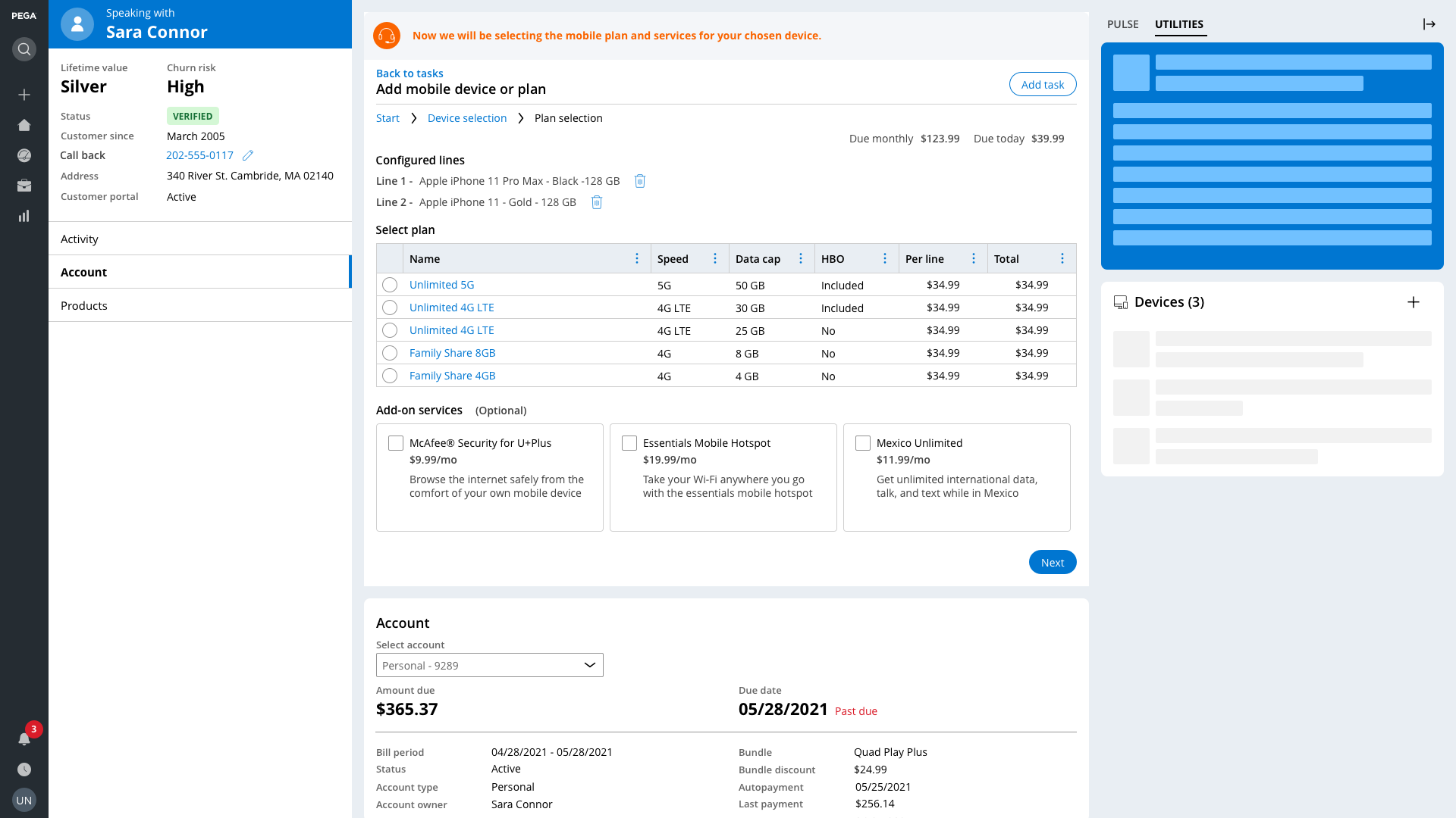
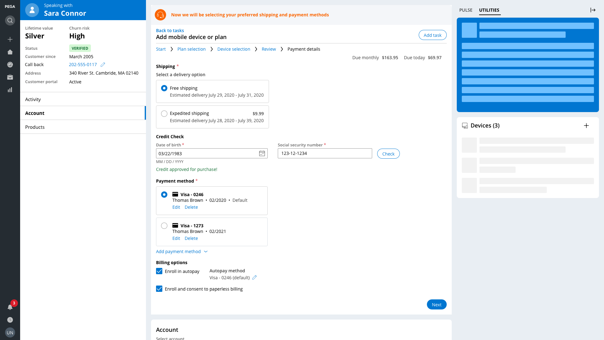
Customer Service for Communications: Add Mobile Device + Plan
I often begin this collaborative process with Job Mapping, defining what exactly the user is trying to accomplish, which leads to User Flow Mapping, defining how these previously defined jobs can be accomplished, and in what order.
The images below showcase the Add Mobile Device + Plan Microjourney within the Customer Service for Communications application. In order to help customers purchase mobile phones and/or plans, we mapped out the specific data requirements, logical steps, and various approaches to ensure a guided and quick process.

Flow mapping allows us to see how each job-to-be-done maps to the overall process. By viewing the experience from both a UX and data structure perspective, we ensure that the application runs fast and the experience is easy to navigate.
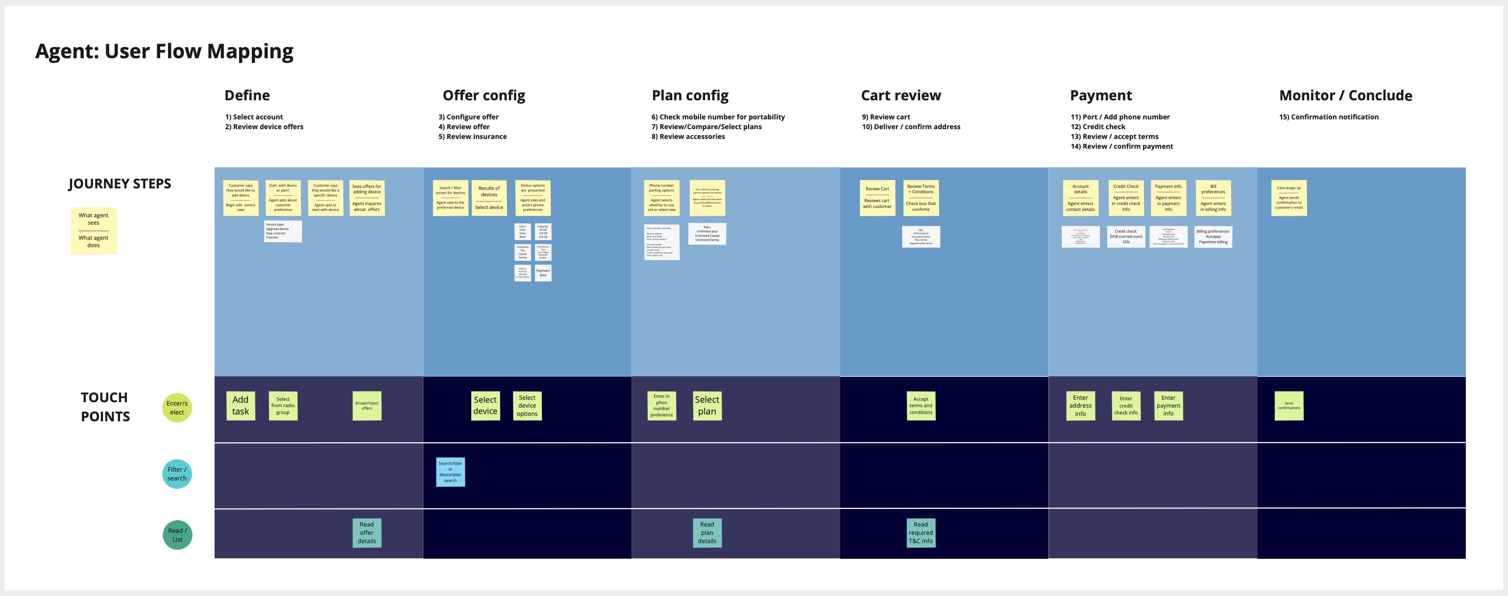
This flow in particular is interesting because users can start the process from two points, which affects both the sequence and contents of each step.
Starting with a device:
- Pega determines the best recommended devices for each unique customer
- Based on device configurations, Pega recommends plans to fit the needs of these devices.
Starting with a plan:
- Pega determines the best recommended plans for each unique customer
- Based on the plan configuration, Pega recommends devices to fit the capabilities of the plan.

Designing Enterprise Experiences
Users should focus on the work they are trying to do, not the tool they are using to do it.
With this in mind, I always begin in lower fidelities, wireframing in order to capture rough flows and UI requirements. I then proceed to design initial mocks using our Pega design system, Cosmos, which is built on React.
Finding gaps in our design system often led to my documentation and iteration of design patterns that were needed by the platform and other teams, in turn helping our Design Systems team.
With initial mockups, the process of vetting and reviewing these designs begins. Business stakeholders and I discuss how our generic flows can be utilized across the different industries and how our clients can configure and customize these experiences to fit their organization’s needs.
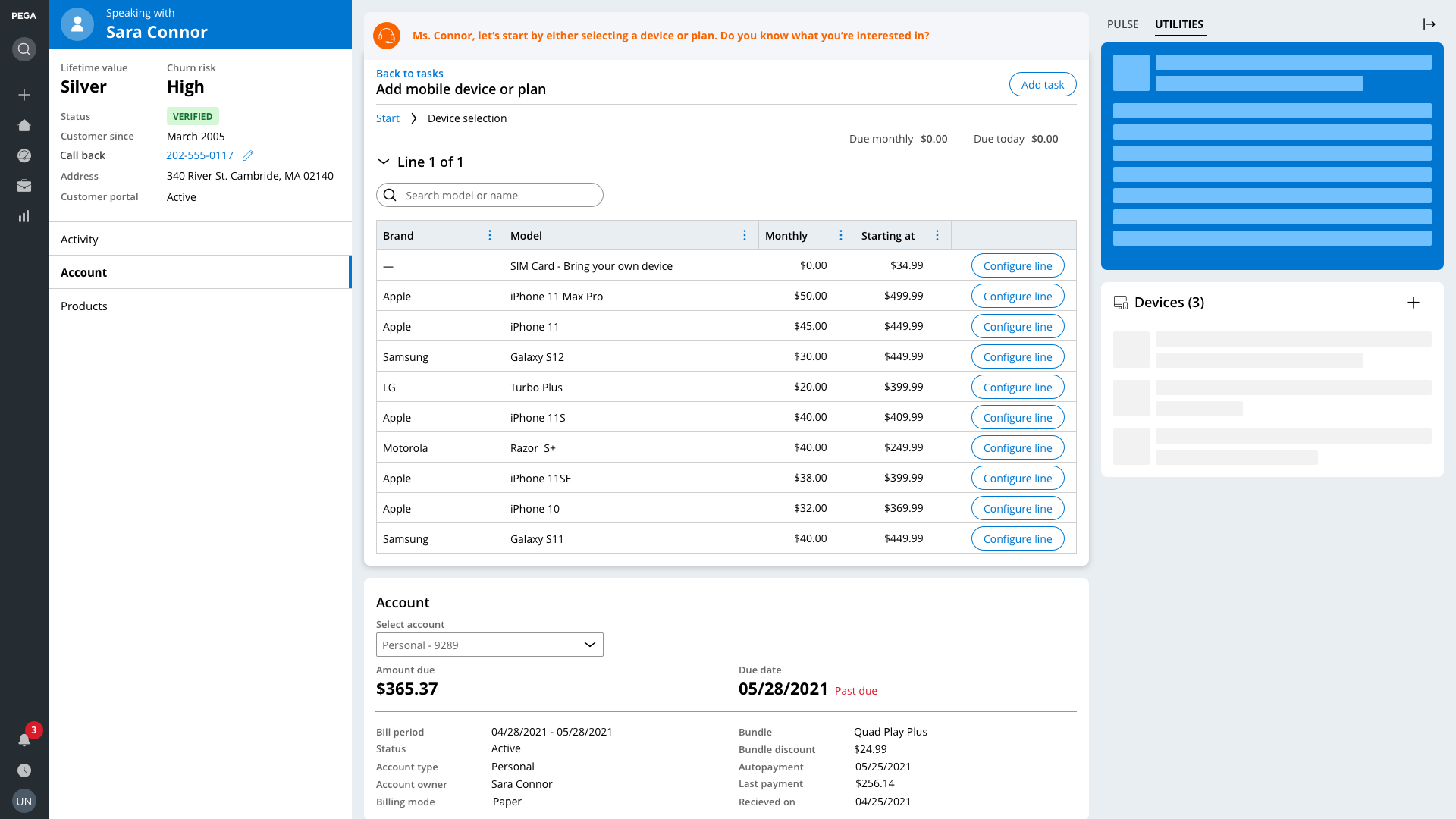
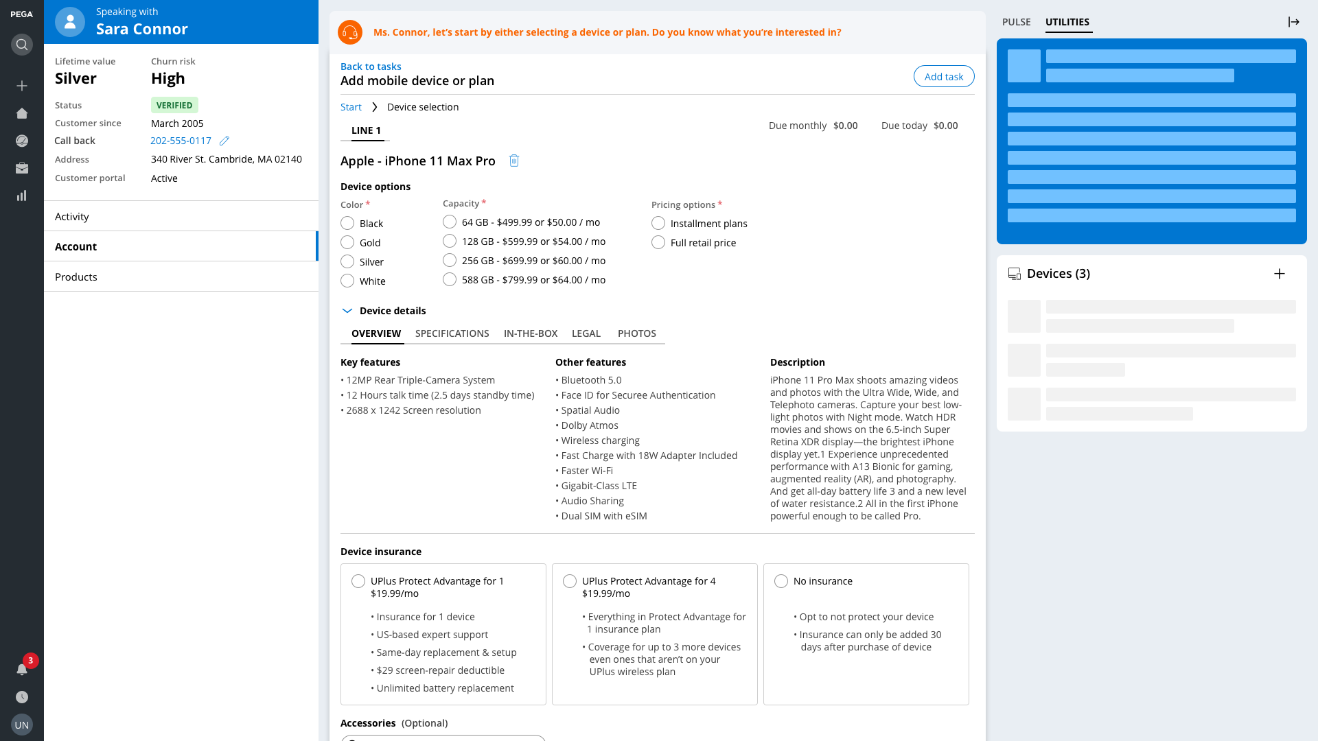
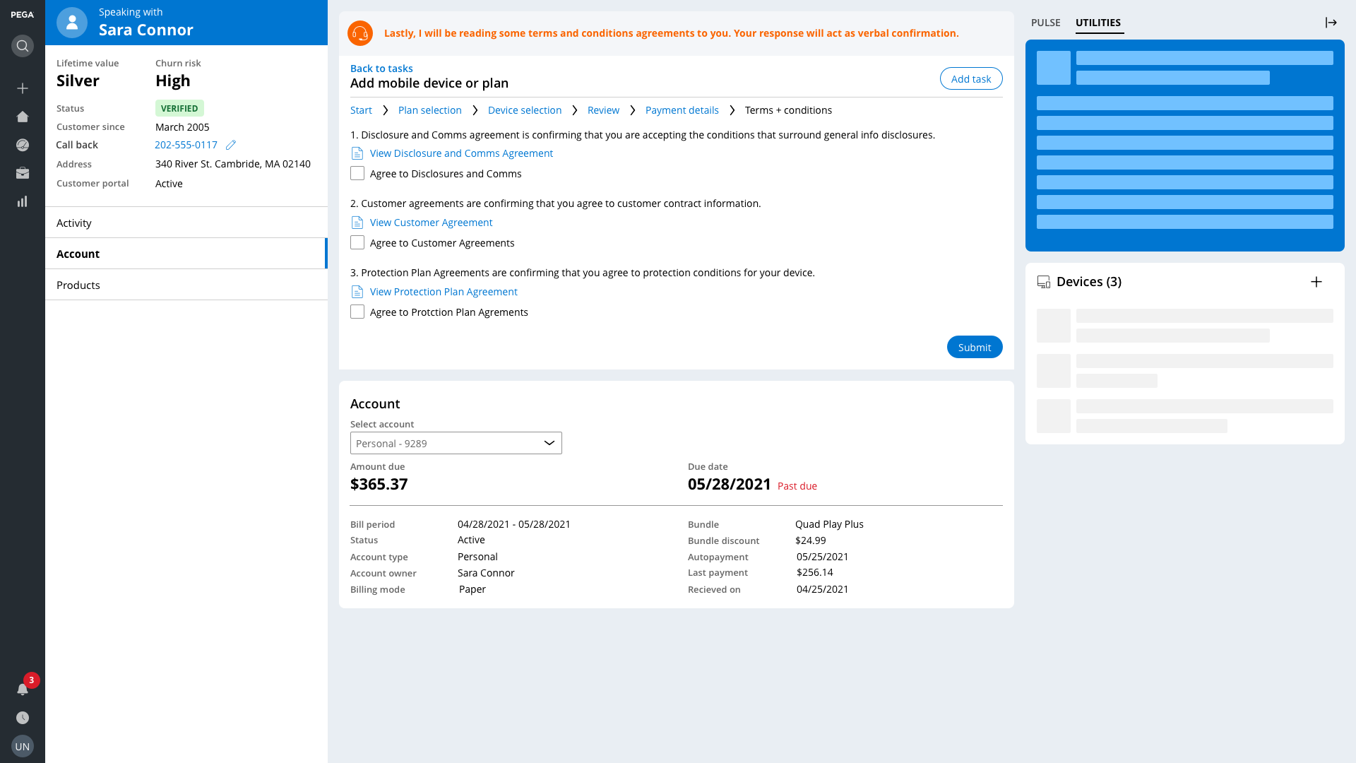
Customer Service for Communications: Add Mobile Device + Plan flow
(Click through the screenshots below to view the flow)


Enterprise customer service has specific KPIs that helped measure and validate my design work:
Average handle time
Reducing the time it takes customer service representatives to resolve customer interactions
Reducing the time it takes customer service representatives to resolve customer interactions
Number of clicks
Reducing friction of interactions by reducing the number of inputs and interactions required
Reducing friction of interactions by reducing the number of inputs and interactions required
Number of steps
Consolidating steps in a process to the minimal, logical lowest common denominator
Consolidating steps in a process to the minimal, logical lowest common denominator
Design System Contributions
In order to achieve modern and efficient UX, I conducted research and interviews with subject matter experts to better understand how each industry is evolving and the subsequent requirements set onto our products due to that evolution.
My process of consolidating functional requirements into common patterns begins with wireframing for the least common denominator design.
We find the commonalities between each industry and across different applications, in order to have a good base that each vertical application can configure to fit its needs. This consolidated approach to pattern and component design helps reduce redundancy of work within both the design and development teams. Being able to view pattern design from multiple scopes, zooming in and out in order to understand how to fulfill UX requirements for a wide audience, was one particular skill that helped produce a great product.
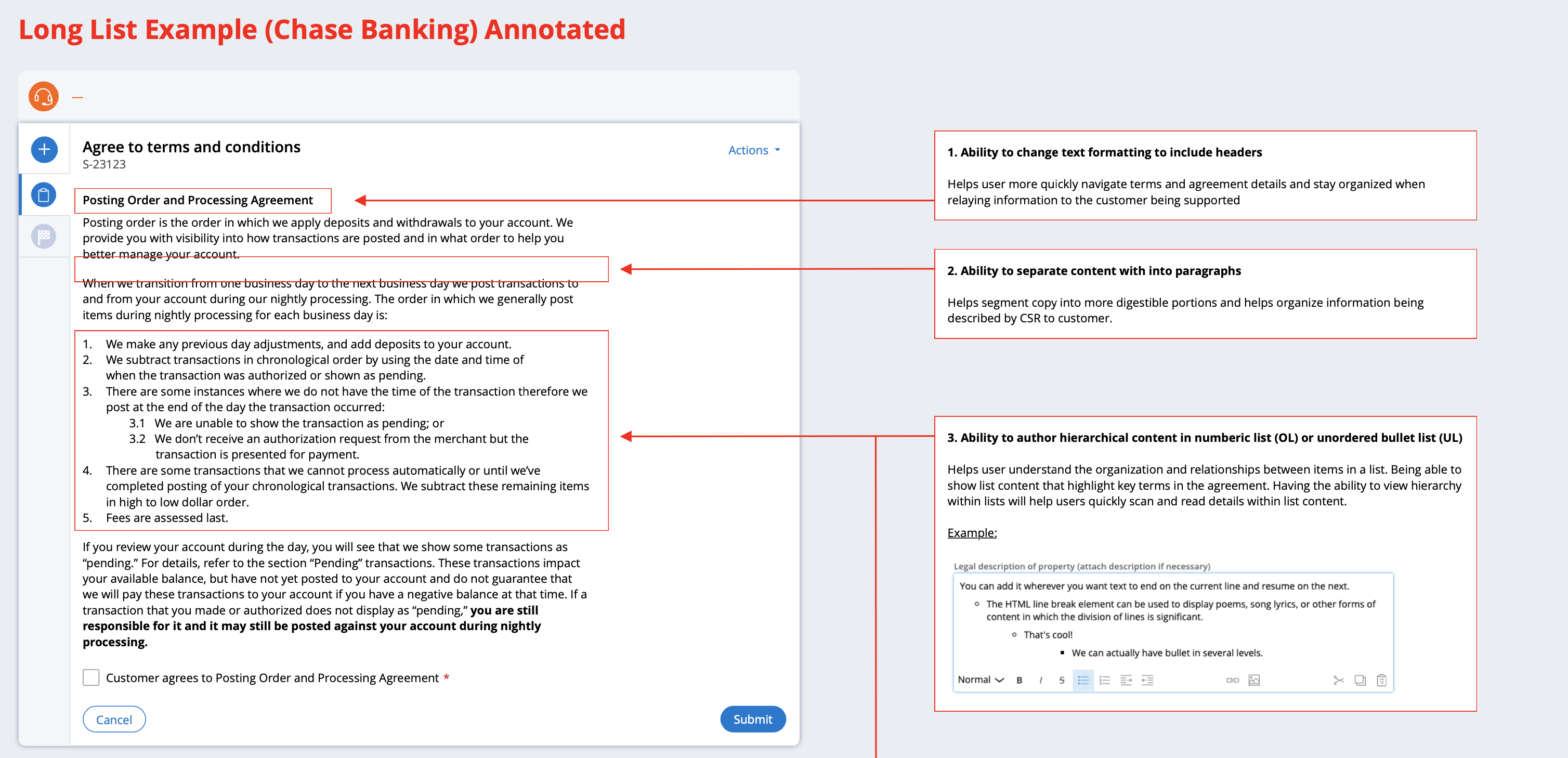
Terms + Conditions Template
This pattern template is defined for our platform team focused on the variability in customer agreement requirements. Due to the various industries that comprise CS at Pegasystems, there are differing levels of both detail and configuration required by clients. In order to define what functionality was needed, a comprehensive audit of agreements was conducted. This resulted in the following authoring requirements for this pattern to fit each use case.

Breadcrumbs Template
I defined a breadcrumb pattern template for our platform team focused on case navigation. Most cases are handled in a linear flow, without needing to navigate to previous steps in a process. However, some flows require users to dive deep into data and traverse back to previous steps in order to respond to customer inquiries.
The breadcrumb pattern is something that has been a staple in web experiences, but within Pegasystems, the data architecture and case management capabilities didn’t support this type of experience until after my specifications were approved and gained support from our platform teams.

User testing and interviews
One of the limitations of being a large enterprise software company is that we often don’t have direct access to our clients’ end users. This means that validating my designs needed a somewhat different approach.
User research methods:
When a high-value client was involved, those with significant investment in our software, we framed our usability tests in a mutually beneficial manner. By showing them what new capabilities we have been working on, they get some foresight into our product roadmap, and in turn, we can review our designs and iterate with more direct feedback.
This is not a common occurrence at Pega, so being creative and tactical with the resources available to me was a constant effort.
One of the limitations of being a large enterprise software company is that we often don’t have direct access to our clients’ end users. This means that validating my designs needed a somewhat different approach.
User research methods:
- User Interviews
- Moderated usability tests
- Unmoderated usability tests
- Online user testing (Usertesting.com)
When a high-value client was involved, those with significant investment in our software, we framed our usability tests in a mutually beneficial manner. By showing them what new capabilities we have been working on, they get some foresight into our product roadmap, and in turn, we can review our designs and iterate with more direct feedback.
This is not a common occurrence at Pega, so being creative and tactical with the resources available to me was a constant effort.
EXPERIENCE
INTERFACE
PLATFORM
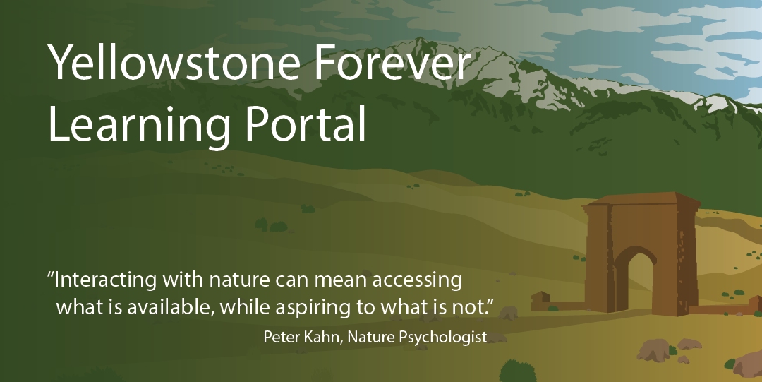
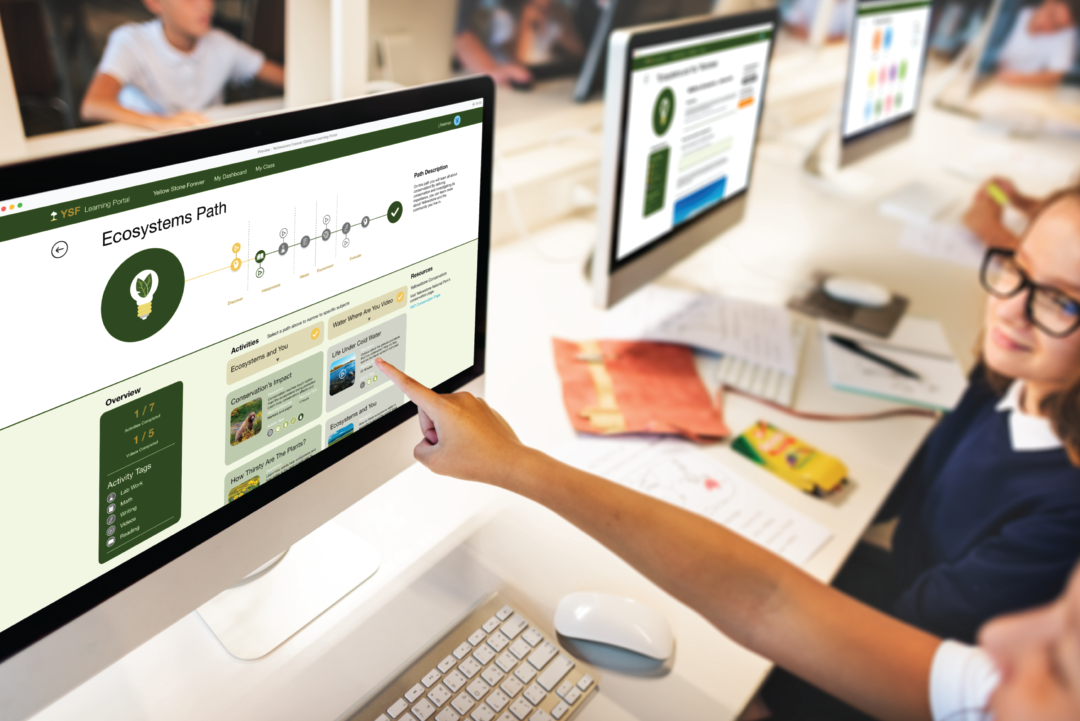
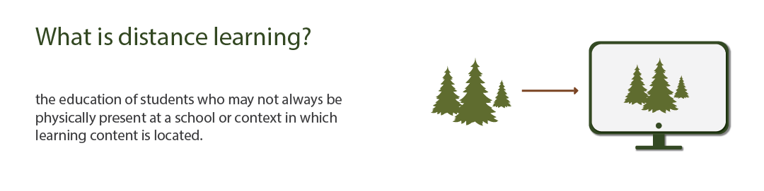
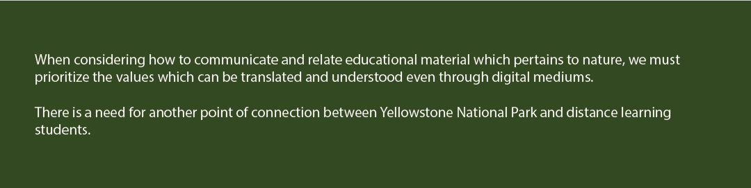
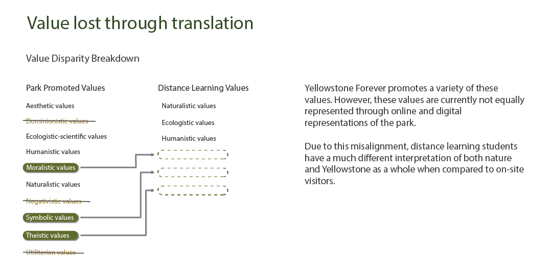
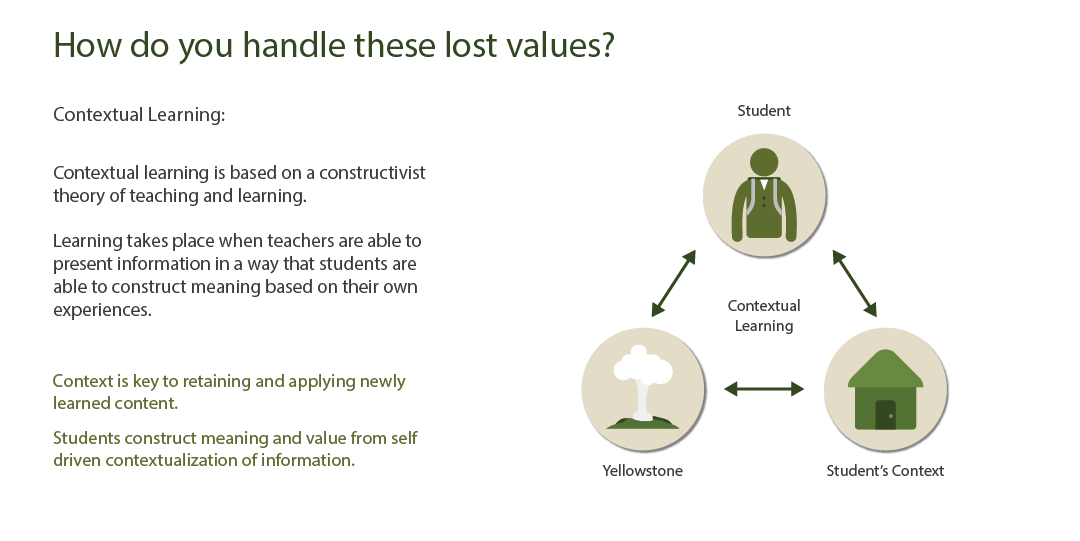
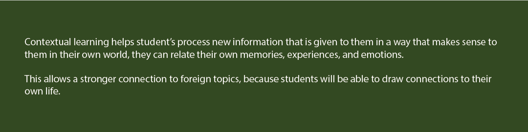
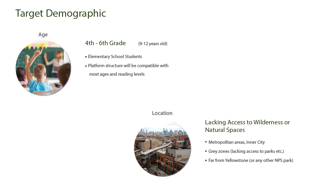
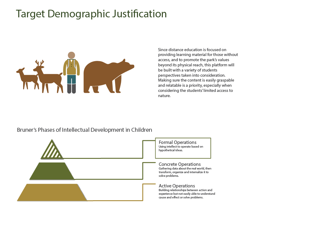
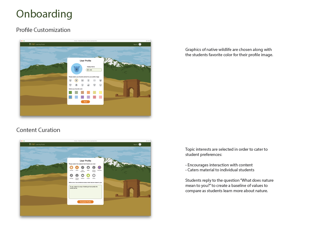
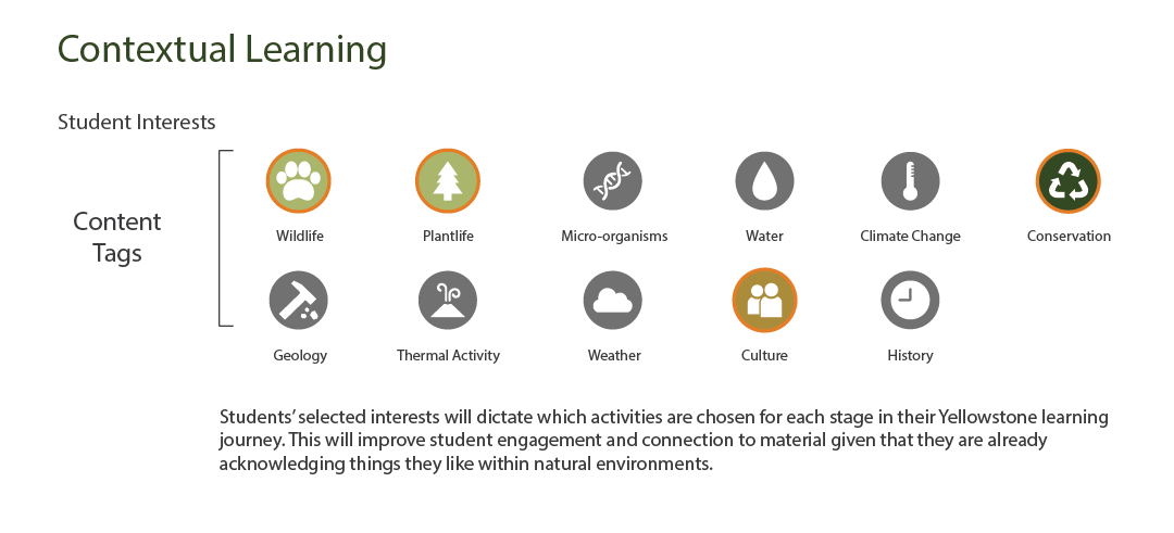
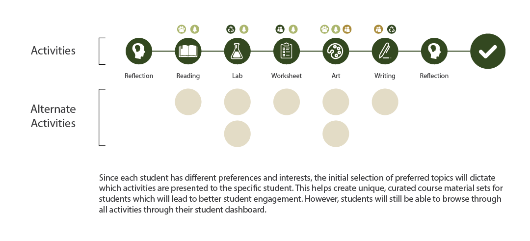
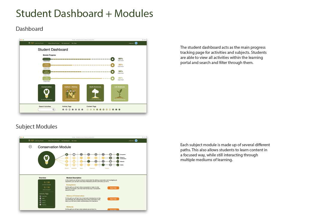
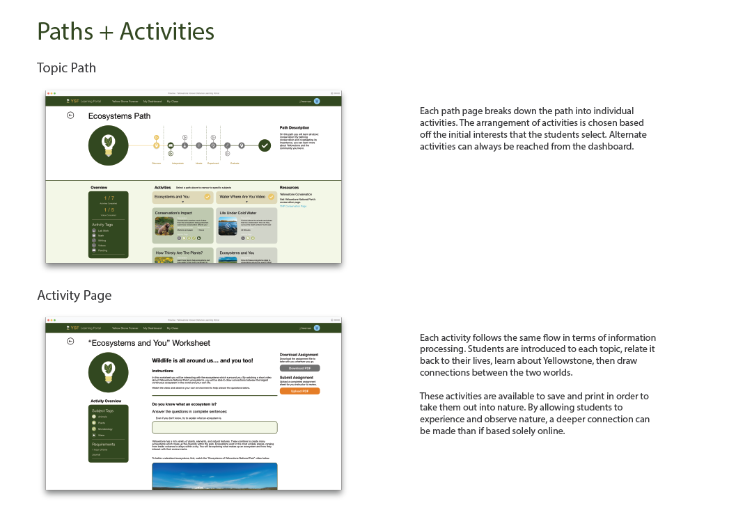
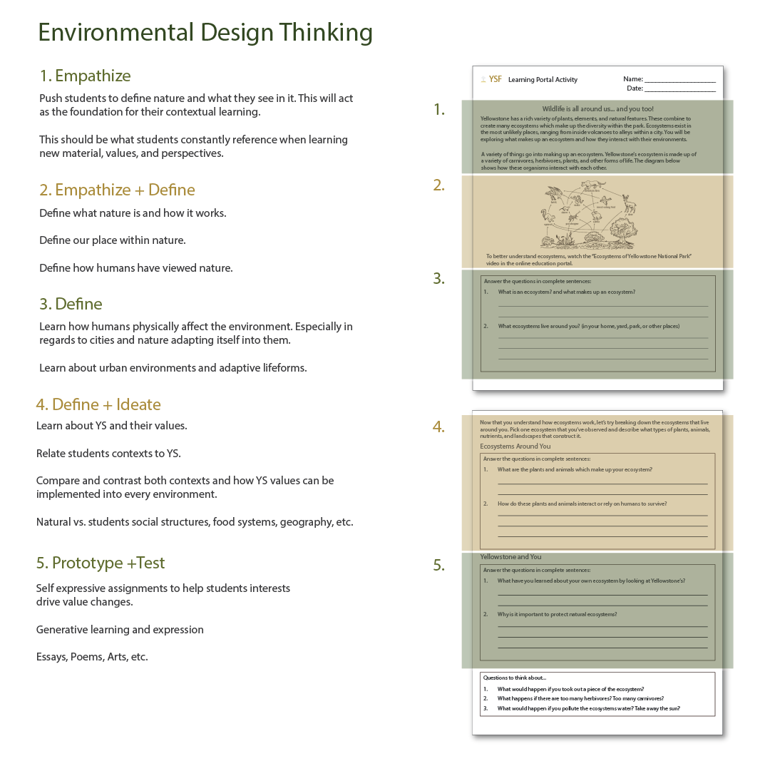
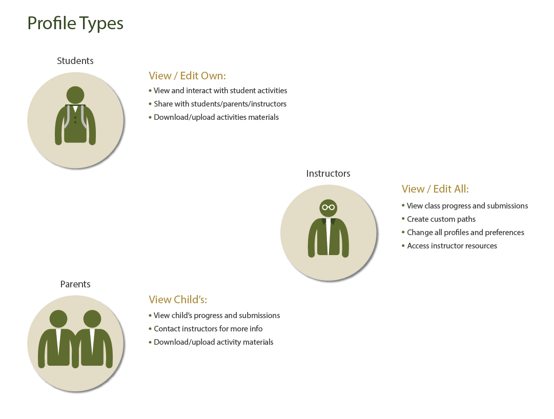
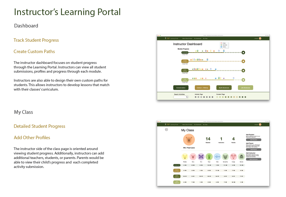
The YSF Learning Portal is a platform for students to not only learn about the beauties of Yellowstone National Park, but to discover the natural world in their communities at home. Yellowstone National Park holds both symbolic and ecological importance for many people around the world. Sharing the magic and beauty of natural environments with students who have little to no exposure to wild spaces was the goal of the YSF Learning Portal.
To engage students who can’t physically travel to the park, this portal enables them to relate their own parallel, lived experiences with the wonders of Yellowstone National Park.
To engage students who can’t physically travel to the park, this portal enables them to relate their own parallel, lived experiences with the wonders of Yellowstone National Park.
Check out the Adobe Blog posts written about this project: https://theblog.adobe.com/series/doing-good-with-design-education/


EXPERIENCE
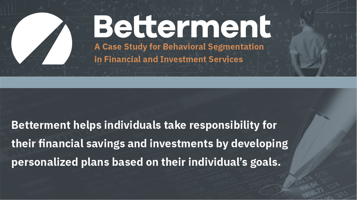
ONBOARDING
RESEARCH
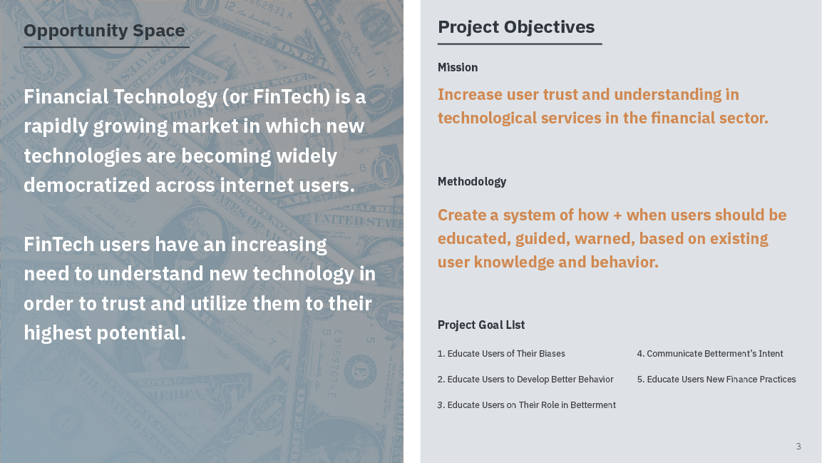
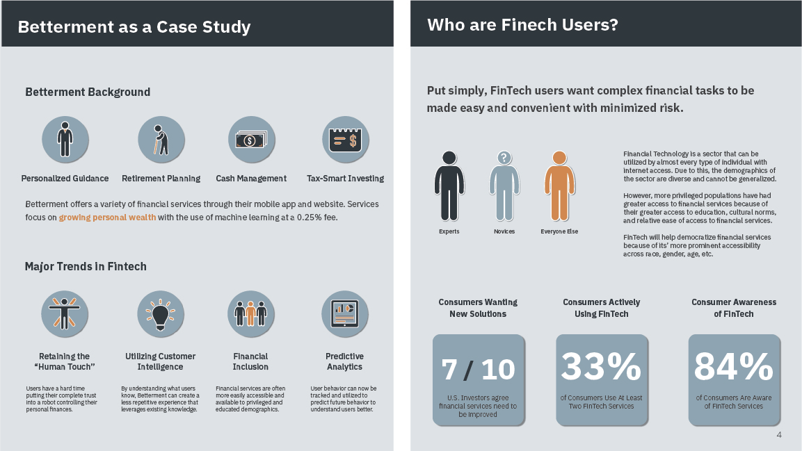
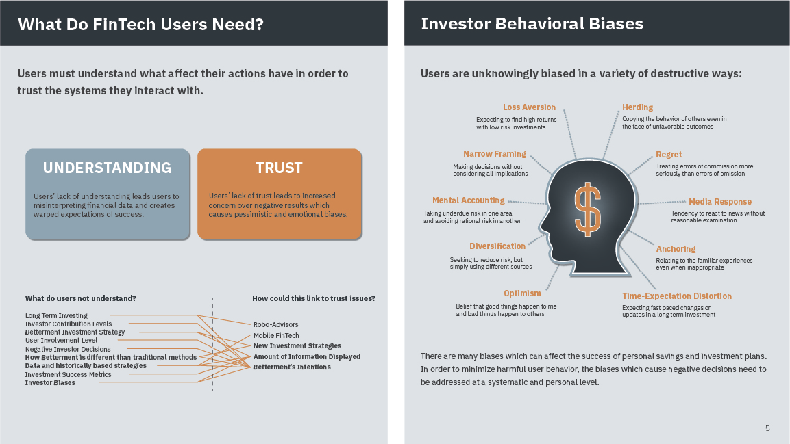
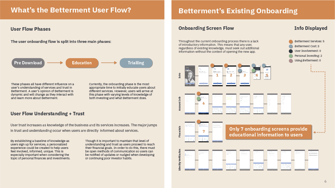
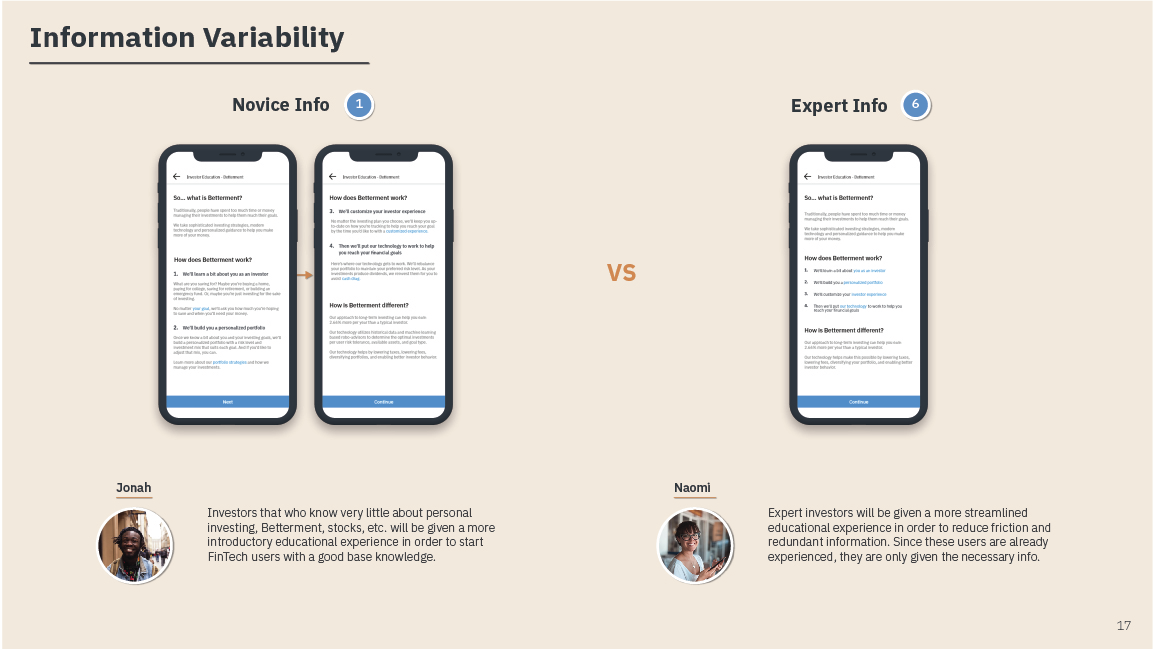
Betterment is a personal investment and banking platform that aims to make attaining your financial goals an intuitive and trustworthy process. In order for users to feel confident in Betterment’s services, there must be a foundation of understanding and trust in their platform. Through a detailed analysis of user dropoff and financial education, I investigated new processes for onboarding users based on their individual needs.
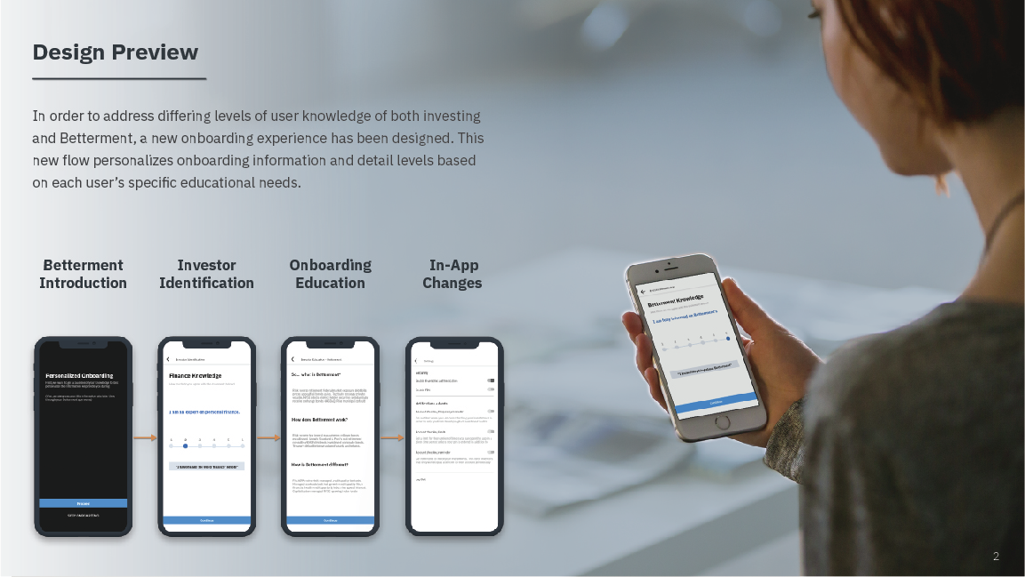


Preview the new onboarding flow:
https://xd.adobe.com/view/9e1cd5a2-b946-4627-6f45-4bdf35d17b96-e82d/

EXPERIENCE
INTERFACE
PROTOTYPING
Overstock aims to provide “Dream Homes for All”, and in order to accomplish that, the vendors supplying the dreams need to efficiently list, discount, and sell their goods.
Working as a UX product designer at Overstock.com has provided me with the opportunity to handle complex and technical design challenges with real consequences. The majority of my design contribution has been within Overstock’s enterprise software group.
I helped design web application experiences to help buyers and partners improve efficiency within fulfillment services. With a wide variety of products, associated data, and configurations, the need for efficient and intuitive product catalog flows was critical.
Bulk Bundles Creation Flows
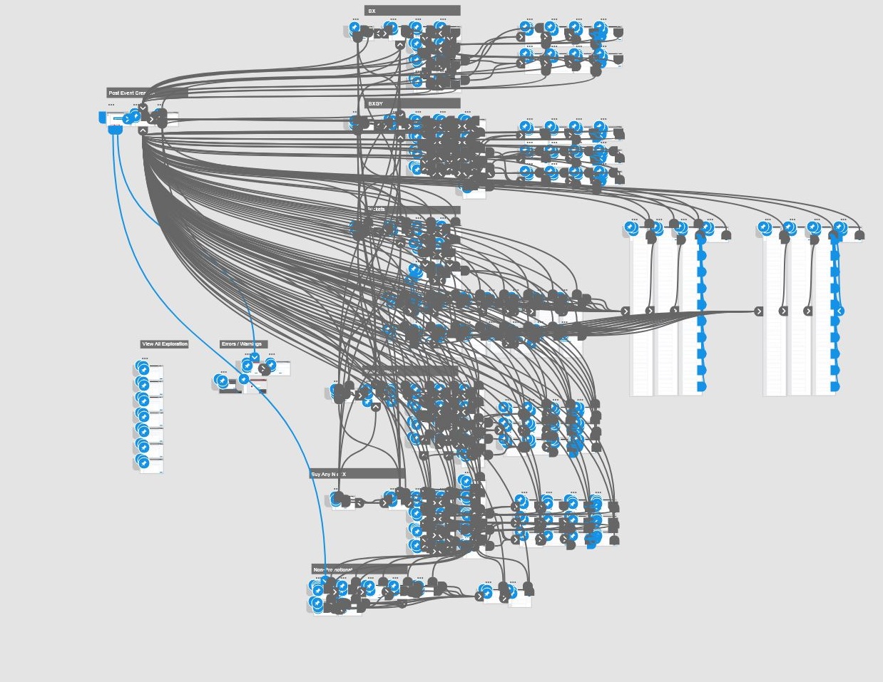
Overstock vendors needed the ability to configure multiple deal types that required a singular intuitive flow. With 15 variations of “Creation Flows” that typically had overwhelming amounts of data for users to process, it was necessary to create a single design that could be used to accomplish the goals of buyers and partners. I collaborated with my project manager, front-end developers, information architects, but was mainly directed by my team’s senior UX product designer.
Starting with general flow information, data surrounding deal type usage, and user goals, I built a functioning prototype, testing my project manager’s proposed user flows. Initially, the flows aimed to have several standalone processes to create individual bundle types; however, I consolidated all of these flows into a single process that would change intelligently based on user inputs.
View Prototype:
https://xd.adobe.com/view/caf65563-7454-4637-50ce-4b2aea4a48e6-bcc7/
Defined Deal Categories:
Buy XThis deal type is made of a bundle of SKUs that are given simple discounts:
- Get dollar amount off
- Get percentage off
Buy Any N of X
This deal type requires customers to purchase a certain number of items to qualify for a discount:
- Get dollar amount off
- Get percentage off
Non-Promotional
Bundle Deal built for convenience (no discount)
Buy X Get Y
This deal type gives customers a discounted or free item based on the bundle of SKUs they purchase:- Get specified item for free
- Get dollar amount off specified item
- Get percentage off specified item
Spend Z Amount
This deal type is similar to bucket deals, however, customers have to spend a certain amount to qualify their cart for a discount:
This deal type is similar to bucket deals, however, customers have to spend a certain amount to qualify their cart for a discount:
- Get dollar amount off
- Get percentage off
Bucket Deals
This deal type allows customers to select multiple items from certain collections or “buckets” to receive a discount on the items picked:
This deal type allows customers to select multiple items from certain collections or “buckets” to receive a discount on the items picked:
- Get dollar amount off
- Get percentage off
1. Bundle Sale Selection
The bundle deal creation flow begins with the selection of a bundle type. From here the required information to create the deal change intelligently based on the desired deal. Since different deals have differing levels of impact on a partner’s business, it was imperative to make every decision clear and meaningful.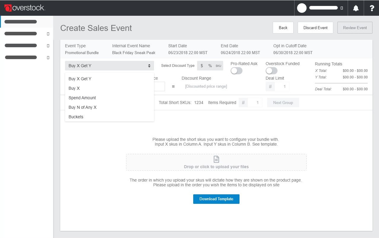
2. Bundle Sale Configuration
Once a deal type is selected, partners are now able to edit the discount details at the top of the page. Once information is entered in, the page will summarize and display the vital information to the right to help users make informed decisions.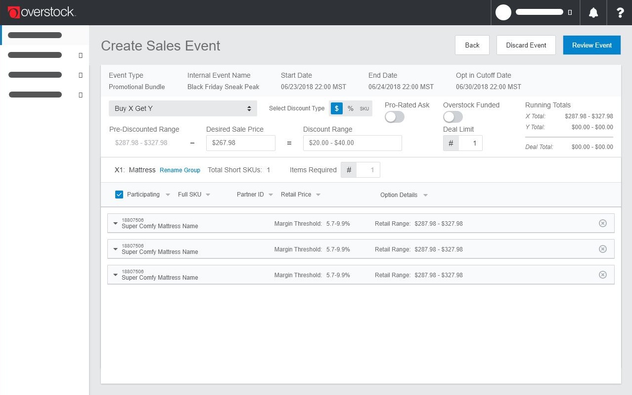
3. Bundle Sale Review
Once a bundle deal has been created, users land on the review page. This page shows users a comprehensive review of their costs, funding, discount prices, and company margins.In order for all of this data to be digestible by users, I found a way to organize the information based on the user’s workflow. Prioritizing the information they need most directly and organizing this data into vertical columns based on related info allows for an efficient user workflow.
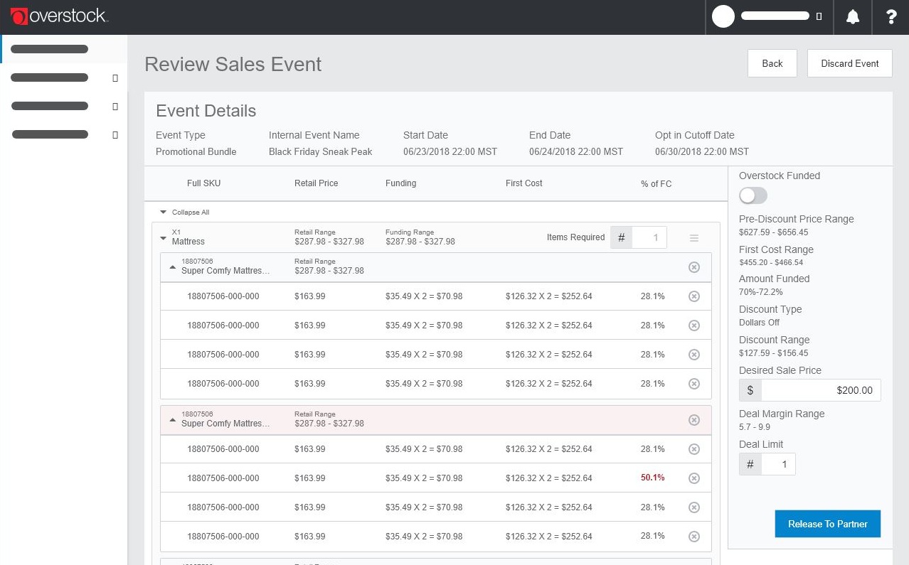
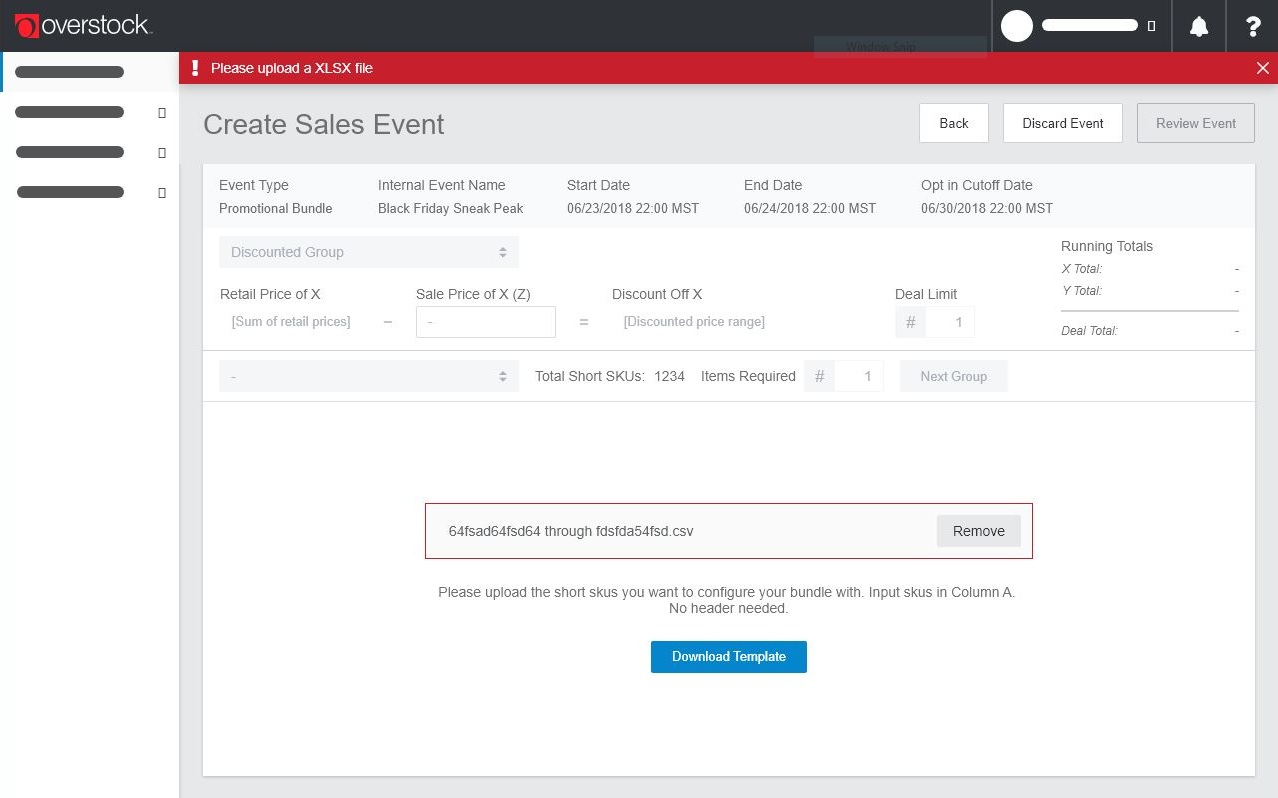
Error States
In addition to designing the structure of the bundle deal creation, I also created a variety of error states to help users understand when they have incorrectly entered information or have exceeded their desired margin ranges for a sale.
 LOGO
LOGOBRANDING
PACKAGING
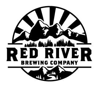
Red River Brewing Company is a family-owned and operated brewpub (and distillery) in the mountains of Northern New Mexico. Being the highest elevation brewery and distillery in NM, this local watering hole offers some of the best food and drink right on Main Street in historic Red River.
Born out of a joking conversation over beers in the garage, Red River Brewing Company was established in Red River, New Mexico, in the Spring of 2018. Surrounded by mountains and based in a historic mining town, this local watering hole attracts everyone from skiers to horseback riders at the end of a long day playing in the outdoors.
Working in collaboration with Britt Felton, I brewed up a charming visual language that will attract travellers of all kinds to the town and remind families of their time in this high desert mountain paradise.

The Red River Brewery
Visual Identity - Logo, Brand, PrintA brand identity designed to give this small local watering hole an unforgettable vibe for travellers, family, and new friends
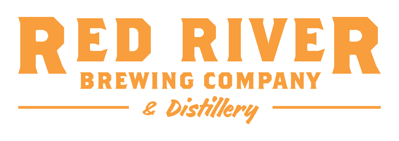
The Red River Distillery
Visual Identity - PackagingAn addition to the business, now a bit more boozy, giving a nod to the old mining history of the small town turned outdoor paradise
BRANDING
LOGO
PACKAGING
Brand Design
Originally a gold mining settlement, Red River is now a mountain tourism hub for much of the Southwest. With the explosion of local breweries throughout the US, our main objective was to create a unique and recognizable brand, while still reflecting the values of the small town of Red River, NM.


Official logo
Red River Brewing Company wanted to visually represent the history of Red River while remaining modern and hip. We created a bold identity that attracts thirsty friends from miles around, while the beer keeps them coming back for more. Additionally, we consulted RRBC on overall interior design and material choices, including furniture designs, bar material, merchandise showcases, signage, tap handles, and much more.
Red River Brewing Company wanted to visually represent the history of Red River while remaining modern and hip. We created a bold identity that attracts thirsty friends from miles around, while the beer keeps them coming back for more. Additionally, we consulted RRBC on overall interior design and material choices, including furniture designs, bar material, merchandise showcases, signage, tap handles, and much more.

Brand logos + colors
![]()
![]()
Midnight Black - 231F20


Campfire Red - D04F53

Burning Orange - FF9F37
Menu Design
Red River Brewing Company boasts a beer menu that competes with breweries that have been around for decades. Since these menus are one of the first interactions customers have with RRBC, every detail had to match both the brewery’s brand and personality.
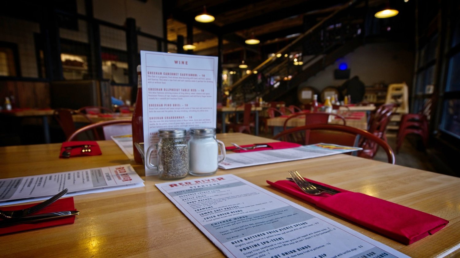
Main menu
The lunch and dinner menus make your mouth water and help you find the best foods to match the best beer you’ll ever have. In order to handle a continuously changing menu, a flexible and legible menu structure was designed. These menus have been designed to be configurable by RRBC and their chefs as their offerings change and evolve.
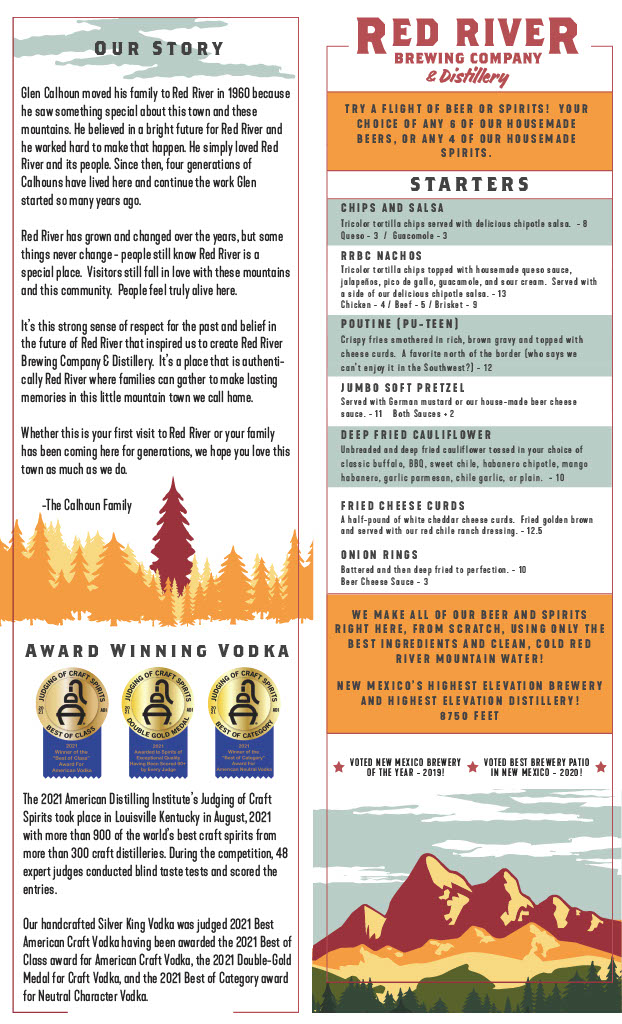
Drinks menu
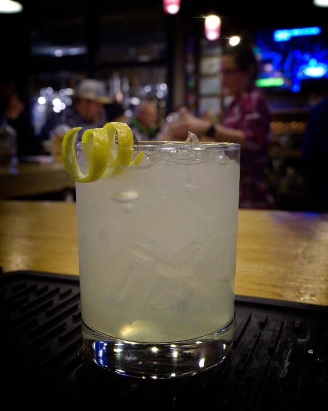
The drinks menu is clearly the most important piece of paper in the brewery. It lists and describes every beer, liquor, and mixed drink available to patrons so they can find the drink that fits them best. In addition to the delicious beverages, this menu also includes infographics describing how the skilled brewers and distillers process raw ingredients to make delicious liquids. This not only helps educate customers, but it also acts as a conversation point with friends, family, and bartenders. RRBC loves talking shop and showing off how they make such great stuff!


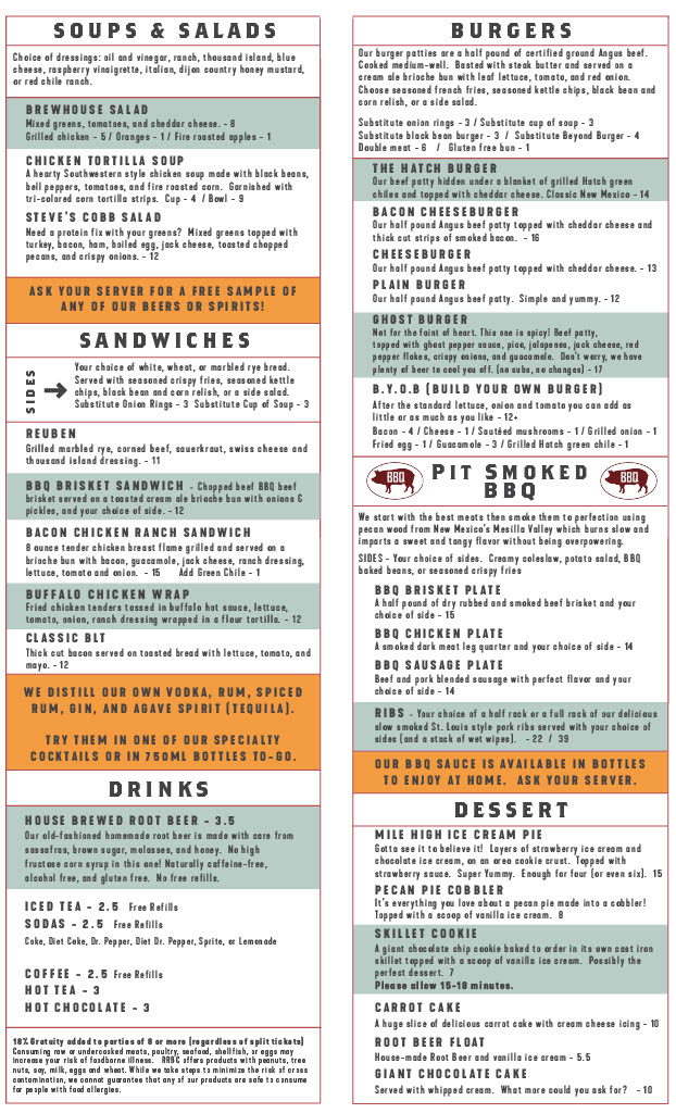
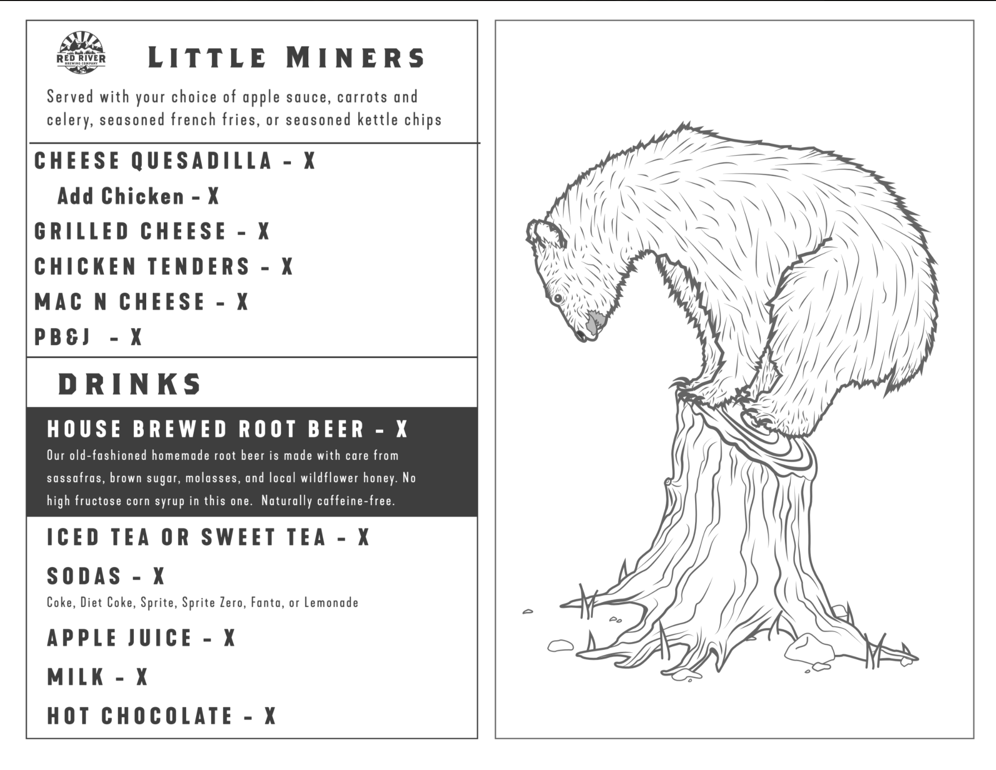
Kids menus
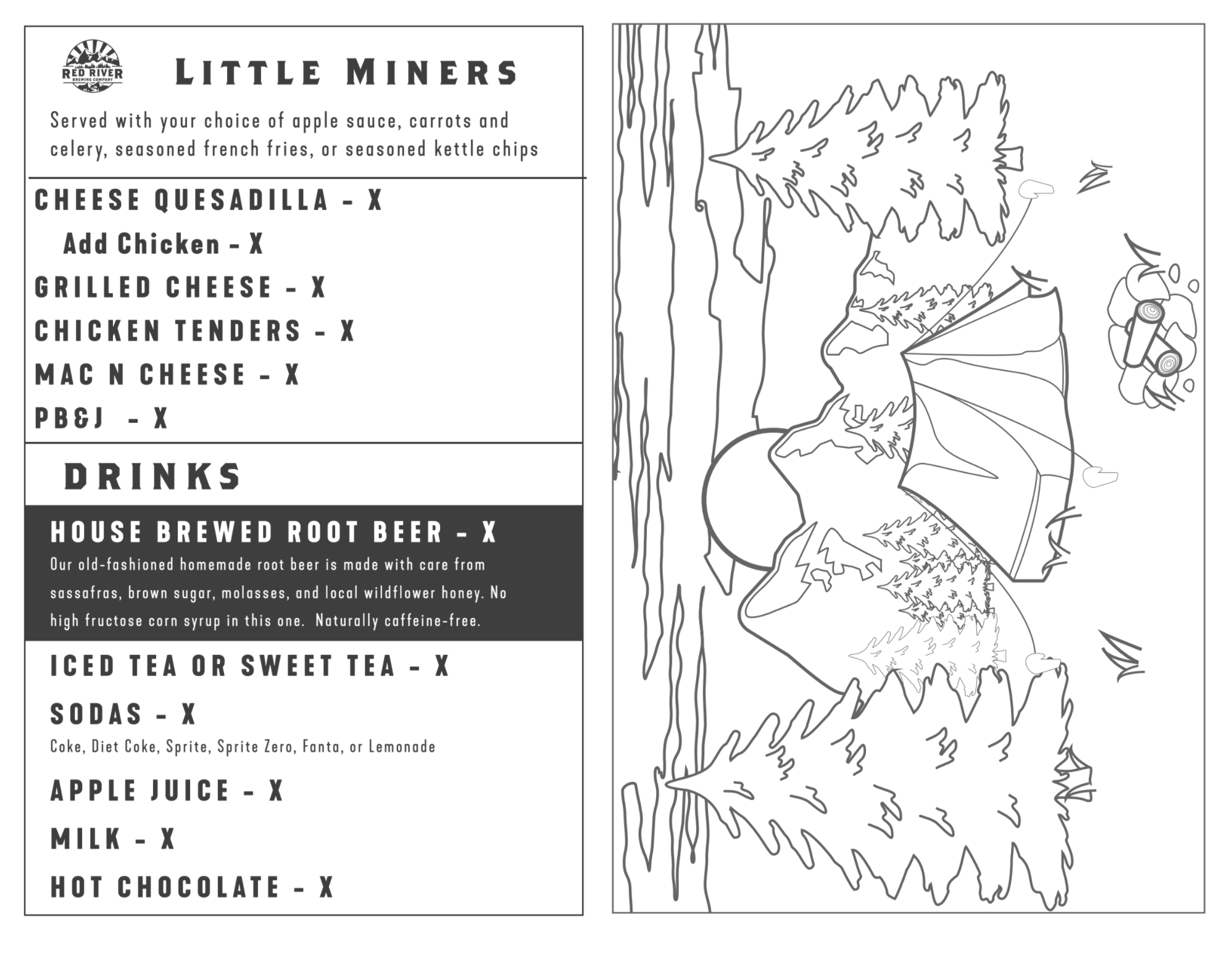
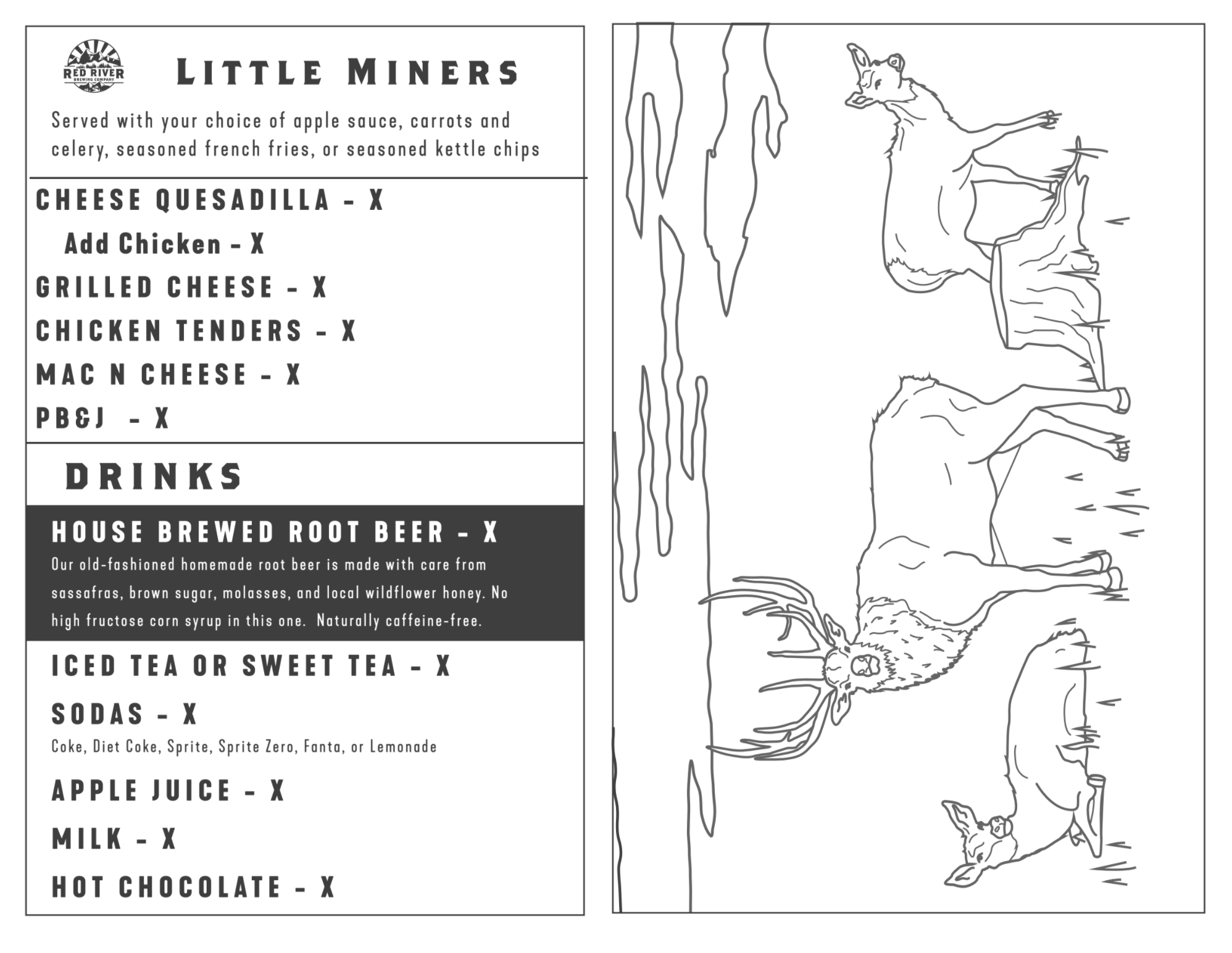
Yes, it’s a brewery and distillery, but RRBC strives to be a family-friendly pub that caters to children of all ages. We all miss the days of crayon baskets and competing with our siblings to make the coolest drawings. These kids menus help kids see and appreciate the local wildlife of Northern New Mexico, while their parents appreciate the fine drinks from the bar.

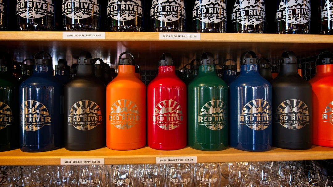
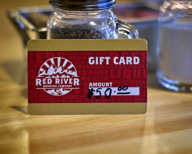
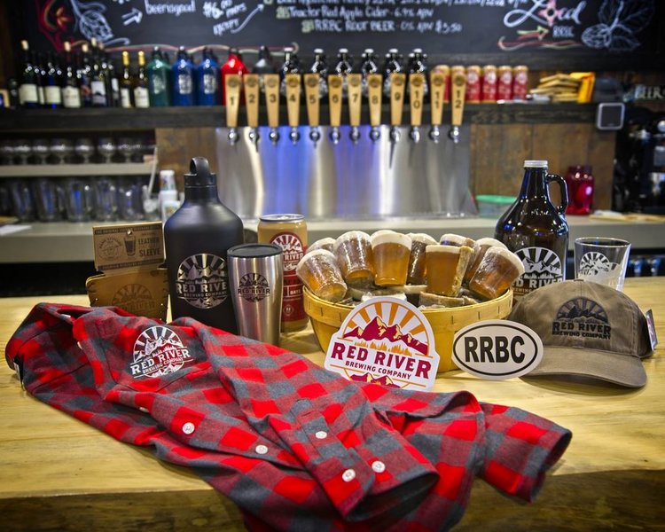
Merchandizing
Since Red River Brewing Company will be visited by thousands of visitors every year, the demand for merchandise is high. Providing a touchstone for customers to remember their good times in Red River is crucial to keeping thirsty people coming back. Take home a hat, shirt, hoodie, or even better, some beer to your family and friends.

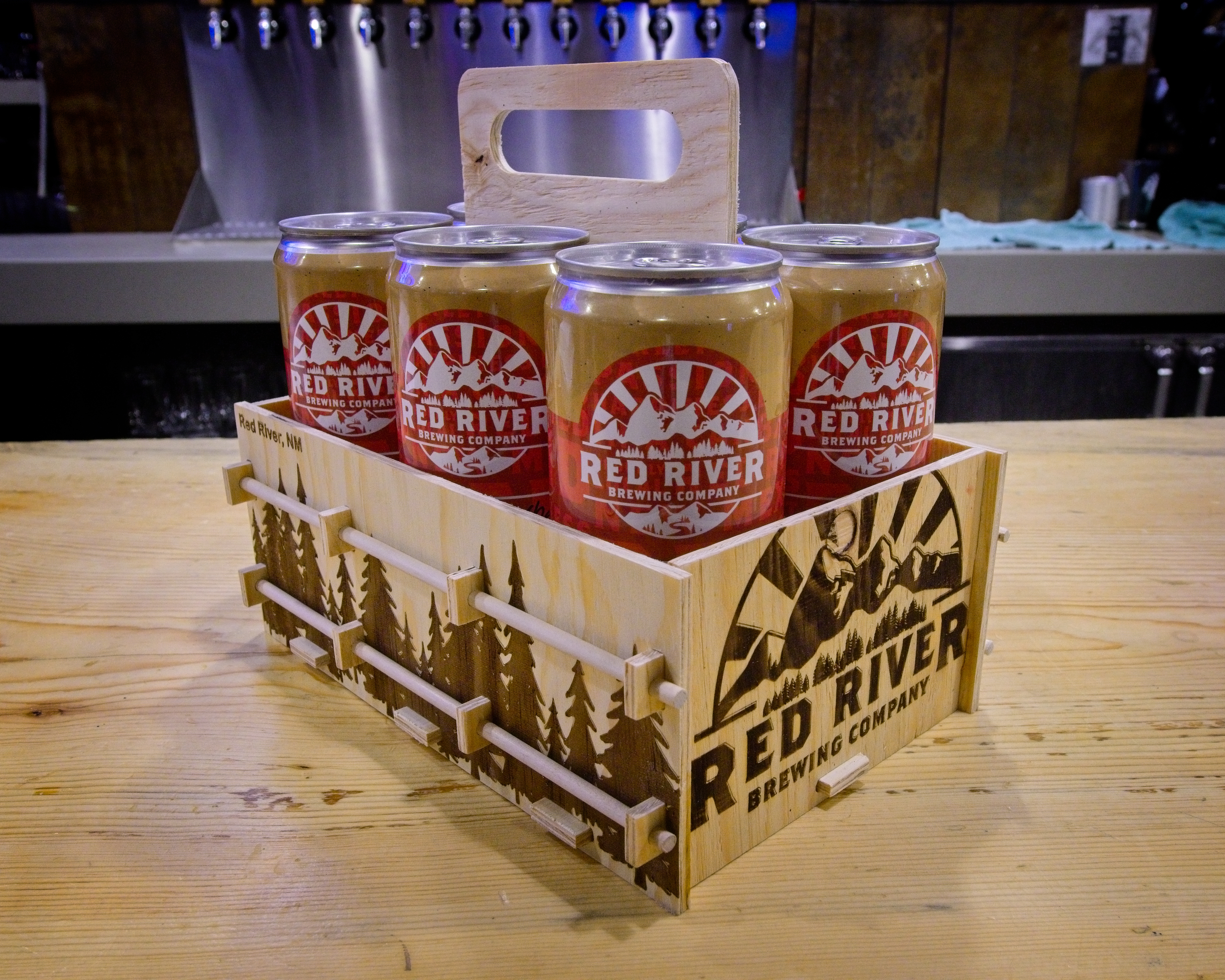

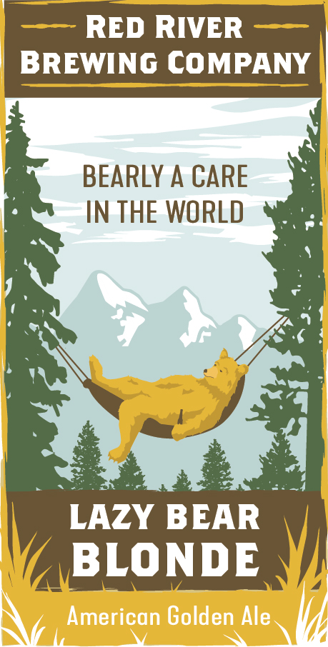
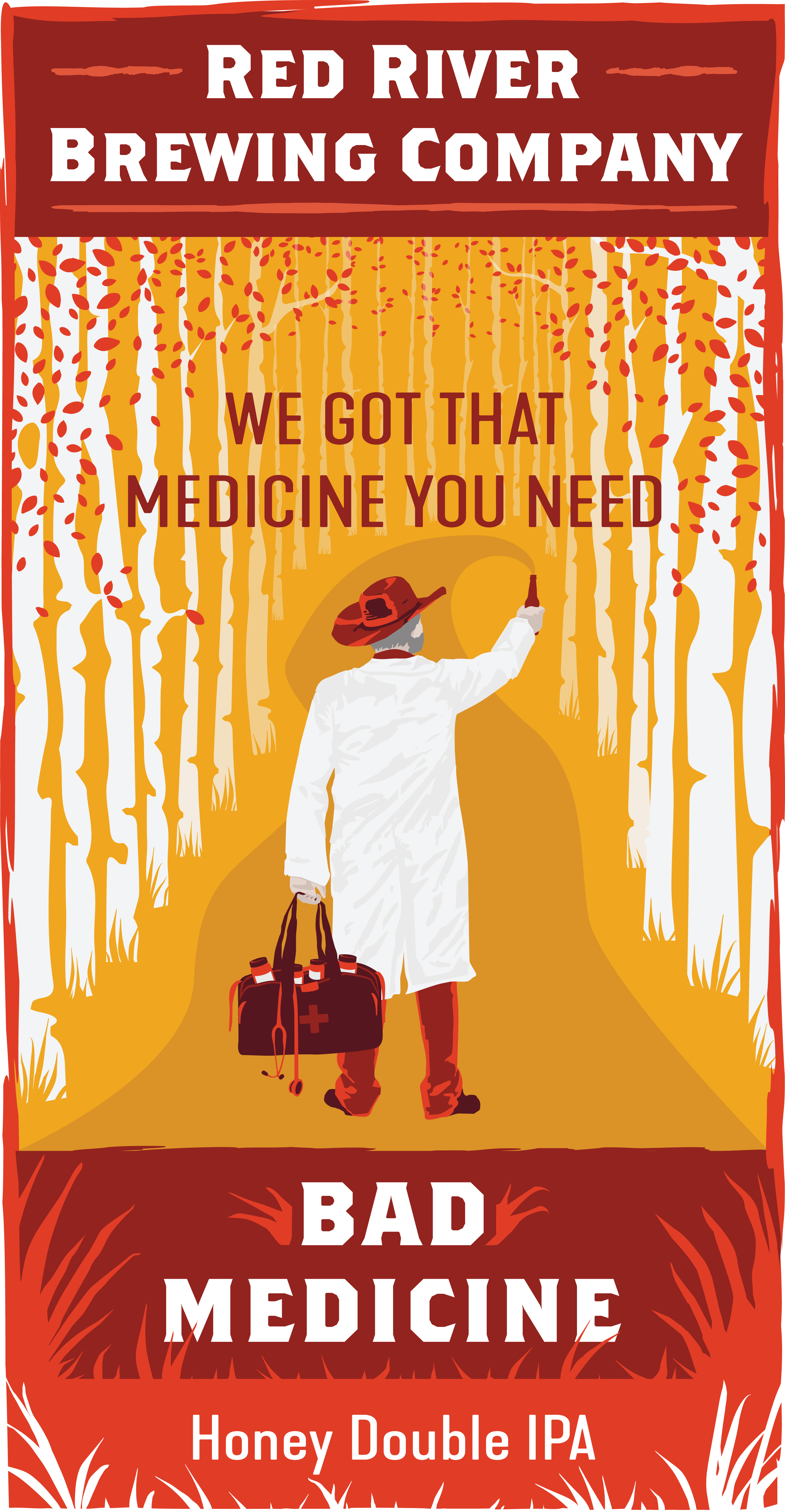
Beer merch
One of my goals with RRBC is to help personify the craft beer they work so hard to perfect. The bartenders often say “the best beer is the one you like” and oftentimes, thirsty patrons won’t try something they are unfamiliar with. These annually released beer graphics help beer lovers understand how brewers view each of their best-selling beers’ personalities.
BRANDING
PACKAGING
The Spirits’ Brand
Two years after the beer started flowing, Red River craved something a bit stronger. Red River Brewing Company began the distillation operation, currently producing eleven types of craft liquor, made with the finest ingredients and fresh mountain water. Defining a brand that felt at home with the overall Red River Brewing Company brand, yet presenting the bold ethos of their southwestern mining town was critical in differentiating the brewery and distillery side of our RRBC products.RRBC Spirits Labels
Red River Brewing Company & Distillery’s liquor was born out of a simple love of great cocktails. With pure, local ingredients and mathematical precision in their craft, these distillers make liquor with fresh mountain water and a lot of care. The hope is that this little mountain watering hole can provide a great drink for any traveler and beer lover. With a liquor for every flavor profile, and the most skilled flannel-wearing bar tenders, each patron leaves with a good old-fashioned grin on their face.
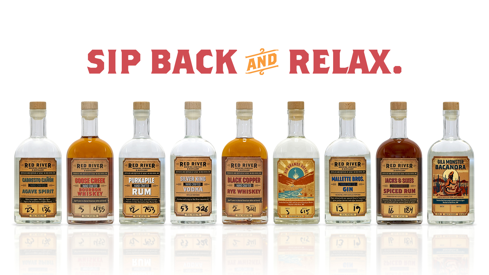
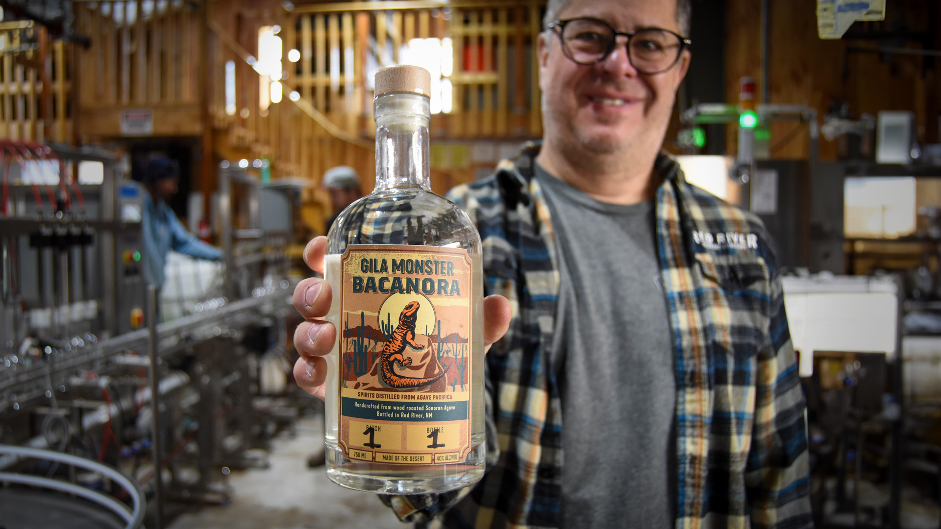
The branding of the distillery was inspired by the rich local history of Red River, New Mexico. The small town boomed in the 1890s with mining fever, and has retained the rugged mountain lifestyle even as the industry shifted to outdoor tourism. The RRBC spirits label aesthetic is an ode to the old southwestern stores that lined Main Street. Bold black print, hints of color that express each spirit’s personality, and room for handwritten markings for the talented distillers, this label expresses who these mountain folk are.
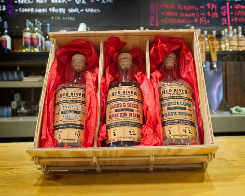


RRBC Cocktail Pouches

While the spirits are the main focus of the distillers, they must also be mixed with fresh ingredients to craft delightful cocktails. Red River Brewing Company + Distillery also offers “good-to-go” cocktail pouches that take on a similar yet slightly different personality. If the spirit labels reflect the old spirit of the Red River miners, these pouches embody the true spirit of mountain relaxation. Transparent pouches to see the tasty cocktails, and space for the hand-written charm of their bar-tenders, RRBC allows patrons to take the bar outside as they hike, bike, or sit by the campfire.


Awards
A young distillery starting as a brewery won prestigious awards in just its first year of producing craft spirits. It was an honor to see my label designs being presented during these awards ceremonies, and I am so proud of the hard work, passion, and love that the brewers and distillers put into the contents of these bottles.
Silver King Vodka awarded Gold 2024
- American Craft Spirits Association
Silver King Vodka awarded "Best of Class" for American Craft Vodka 2021
- American Distilling Institute
Silver King Vodka awarded "Best of Category" for Neutral Character Vodka 2021
- American Distilling Institute
Silver King Vodka awarded a Silver Medal
- Sante' Magazine 2021
Purkapile Rum awarded Bronze Medal 2021
- American Distilling Institute
Silver King Vodka awarded Silver 2023
- Bartender Spirits Awards 2023
Silver King Vodka awarded Double-Gold Medal for Craft Vodka 2021
- American Distilling Institute
Cabresto Cañon Agave Spirit awarded Bronze Medal 2021
- American Distilling Institute
Silver King Vodka awarded a Gold medal 2021
- Sunset International Spirits Competition
Mallette Bros. Gin awarded Bronze Medal 2021
- American Distilling Institute
GRAPHIC
EDUCATION
Offering students a deeply engaging, collaborative environment to solve present-day issues, the University of Utah Praxis Labs allow students to learn and grow as they help local communities. This collaborative experience, which allows all majors and experience levels, required a bold marketing campaign to attract and excite students about a better future.
Passion for impact, love for the surrounding communities, and the curiosity of young, talented students inspired the resulting graphic style.
Passion for impact, love for the surrounding communities, and the curiosity of young, talented students inspired the resulting graphic style.
University of Utah Praxis Labs
The Praxis Labs are in-depth studio-style courses that allow students to dive deep into real-world problems. By designing a modern and engaging representation of each course, students were more likely to take part in solving these critical community problems.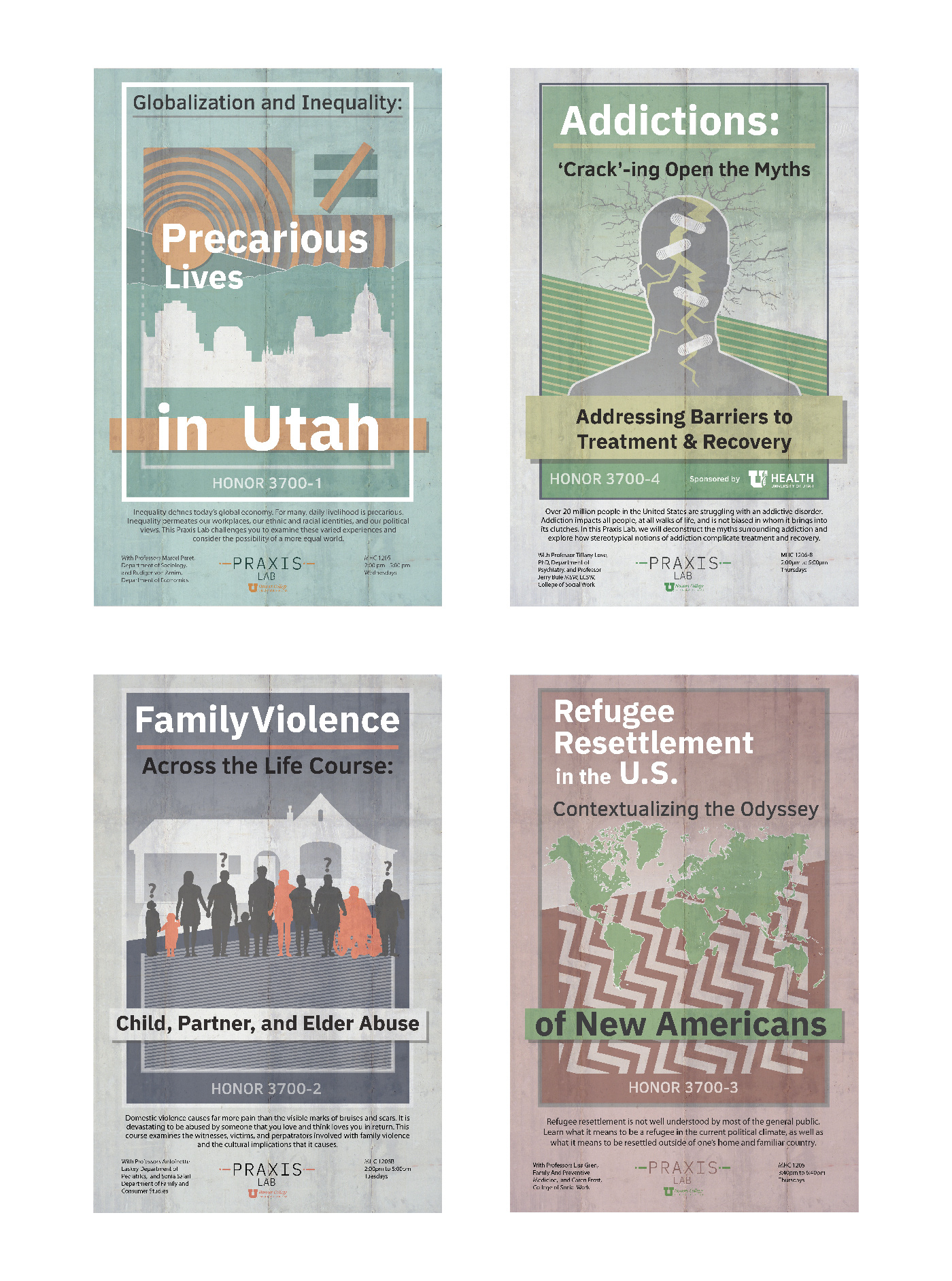
University of Utah Honors College Events + Courses
This collection of posters was designed for individual professors within the University of Utah Honors College to help promote courses and events to undergraduate students. Topics vary widely, but the overall design aesthetics tie together to bring some uniformity within the Honor’s college courses.
Research + publications
Below you will find a list of research and publications that illustrate my design process, showcase my skills, and give insight into how I approach problems with design thinking methodologies.
Pegasystems: How to design for customer experience - Part two
At Pega, designers use design thinking methodologies for Microjourneys™ not only to create an efficient and user-friendly flow, but also to streamline how we collaborate and build experiences as a team.Adobe: Fostering Design Leadership
The University of Utah’s Multi-Disciplinary Design program has students prototype digital experiences that solve real-world problems faced by Yellowstone National Park, like this distance learning product by Steven Calhoun (yours truly).
Adobe: Yellowstone National Park Distance Learning Platform
University of Utah student Steven Calhoun (yours truly) demonstrates the user flow of his digital product research project, the Yellowstone Forever Learning Portal, created in Adobe XD.
Spark Labs: University of Utah Hospital Recycling
The focus of this lab, lead by design research fellow Steven Calhoun (yours truly), is on the people who experience and deliver health care within the University of Utah hospital system. The lab utilizes the talents and passions of professionals and students to design new solutions that improve patient experience.